HTML Forms - Examples and styles with CSS for controls
A form is an interactive area of our website, where we provide the user with controls and fields to enter or choose data.
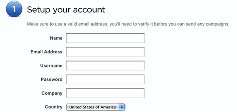
The W3C and the WHATWG have been working for several years to improve the old web forms, with the goal of increasing their usability from a strong emphasis on touch screens, simplifying data validations and facilitating the creation of new controls Interactive that until now required programming, reducing in this way the use of scripts. The tendency to future is that if a control or validation of form data can stop being done by a script.
EWe are talking about the "previous" validation to send the data, that is, the one carried out in the browser, on the client's side, that will never replace a complete validation on the server side (with PHP or similar languages), but only has as a goal to improve the usability of a form, avoiding that the entire page be reloaded only to warn that a data was missing or that the expected format was not respected.
To achieve these goals, HTML5 adds a series of new input types and a set of new attributes applicable to form elements, which we will learn below.
Basic structure of a form
Let's first review the basic structure of a form, based on a simple example:
<form action="respuesta.php" method="post">
	<fieldset>
		<legend>Suscribirse al Boletín</legend>
		<p><label for="casilla">Correo electrónico:</label>
		<input type="text" name="casilla" id="casilla"></p>
		<p><input type="submit" value="Suscribirse"></p>
	</fieldset>
</form>
Conceptually, a form consists of an interactive area on our website, where instead of showing data to our user, we provide controls and fields for that is the same user who enters or chooses data, which will be sent from your browser to the server. Then, a server-side programming language such as PHP, takes care of doing something with that data sent by the user, typically stores it in a database or sends it by email.
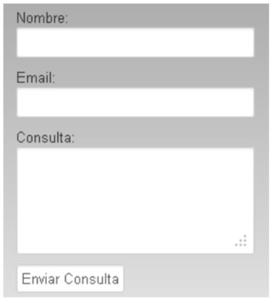
If we go into the code, we will see that a <form> tag must wrap around each form area of a page (it follows that there may be more than one form per page), and within this <form> tag, we will group with a <fieldset> tag each set of fields related to each other, being usual to add a descriptive <legend> to each group of fields.
<form>
	<fieldset>
		<legend>Suscribirse al Boletín</legend>
	</fieldset>
</form>
Then, each control will be associated with a <label> tag that indicates what data should be entered in the field, and in the form to make this association (previously done with divs, or list elements) we have the first novelty of HTML5 relative to forms with respect to previous versions: the W3C explicitly asks us to group a field with its respective <label> by means of paragraph labels, since conceptually a form is a text, of which some parts are provided by the author of the form, and another part of the contents is provided by the user.
Let's go back to the example:
<p>
	<label for="casilla">Correo electrónico:</label>
	<input type="text" name="casilla" id="casilla">
</p>
With a paragraph that involves both to the label as to the input, we solve the structure of the form (unlike what we have been doing, with tables, or divs, or breaks, or definition lists, only to order each pair label / field).
Within the opening of the <form> tag, the main attributes that we can apply are the following
Action
Undoubtedly, this is the main attribute for the operation of a form. Its value must be the URL of a file programmed in a server language, such as PHP, ASP, JSP, etc. so that this file receives the variables sent from the form (one for each form control), and can do something with that data (typically, insert them into a database on the server, or send them by email to the site administrator).
The value of the action attribute also determines to which page we will be taken once the "send" button is clicked. This, then, is similar to a link.
Example:
<form action="respuesta.php">
That page "respuesta.php" is the one that must contain the necessary server programming, and at the same time it is the page that will be loaded after pressing the "Send" button the form.
Method
On the other hand, the method attribute specifies which of the headers or headers of the HTTP protocol will be used to send the data entered by the user to the server. The possible values of the method attribute are 4: post, get, put and delete. Typically, post is used, which means that the sent variables are not observed in the URL, as is the case with get.
Example:
<form action="respuesta.php" method="post">
Autocomplete
This attribute has a default value of true, which means that the browser will memorize the data that we enter in a field, and when we return to that same page to complete the same field of the same form, the browser will show us the previously entered values, allowing us to choose it from a list displayed below the field, saving us the typing.
But if for reasons of privacy or security (as in the case of users of shared computers that will see the data entered by another user in the same place they entered) we would like to deactivate this functionality in all the fields of a form at the same time, it suffices to place within the <form> tag the attribute: autocomplete=”off”. This prevents the browser from memorizing what is entered in all its inputs:
<form action="respuesta.php" method="post" autocomplete="off">
Novalidate
In HTML5 there is a single truly new attribute at the level of the <form> tag, which is called novalidate. When placing it (it is Boolean, that is, it can simply be or not be, it does not have values that we must declare), it disables the automatic validation of all the fields of this form. Later we will see in which cases it can be useful to deactivate this validation performed by the browser on its own, for example, to program our own validation with JavaScript.
Example:
<form action="respuesta.php" method="post" novalidate>
Done this basic review at the level of possible variants within the <form> tag, we will see below what are the new attributes of each form control, which will allow us to reduce the amount of code (JavaScript) necessary to have functionalities typical of a form, as well as to validate the data entered.
Functionality without JavaScript
One of the main objectives of the news related to forms in HTML5 is to reduce the use of JavaScript for many of the typical tasks of any form: display a text within a field (and disappear when focusing on it) , focus automatically on the first field of a form, validate that the content of a field conforms to the rules defined when creating the field (that is of the expected data type, if it is obligatory to complete it, that it is within the range of allowed values, etc.)
Let's see how easily this is done, thanks to the new attributes that we have in HTML5.
Default text (placeholder)
The functionality of displaying a default text within a field is called placeholder. Unlike the value attribute, it is not sent to the server as a value of the field, which facilitates validation with a server language such as PHP, since it avoids adding a conditional that includes the text of the value. The placeholder solves this problem, since its text does not replace the value, and if the user does not enter a value in the field, the value remains empty, simplifying the programming.
The way to implement a placeholder text is very simple:
<input type="text" placeholder="Escriba su nombre">
Inside the field will appear the defined text:

When making focus in the field (clicking with the mouse or arriving with the tabulator), that text will disappear, and if we write something it will no longer appear; but if we erase the writing, leaving the field empty, the placeholder text will again be displayed, to warn the user about the task that was left pending.
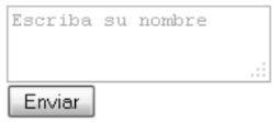
It can also be applied to a textarea, not just an input, as we see in the following image:
Autofocus (foco automático)
Another typical functionality in the forms is that of the autofocus attribute , that positions the cursor automatically in the first field to be completed, helping the user to locate himself in his first task within the form. Of course, we can apply this attribute to only one field per form (since there can not be two cursors focusing simultaneously). And if by careless we apply it to two or more controls within a single form, only the last of the fields will remain active, since the browser sequentially reads our source code.
<input type="text" autofocus />

We will see that the cursor remains blinking, waiting for us to use that field.
Autocomplete
As already mentioned when talking about the <form> tag, we can deactivate the autocomplete, and we can do it in a single field and not in all the fields of the form at the same time, simply including this attribute in the input that we want do not memorize their values over time:
<input type="text" autocomplete="off" />
In this way, the drop-down list of previously loaded values in that defined field will never appear.
Required
If we want a value to be mandatory in a field (and, if not, not allow the form to be sent), we must use the required attribute:
<input type="text" required />
Here we will see for the first time the effects of the automatic validation carried out by the browser: if we click on the "Send" button of the form, leaving a field marked empty as required, the form will be forbidden and posters will appear warning that the field is mandatory.
Each browser will display the text of those posters in the language of that browser, and with certain decorative effects of its own.
Let's see some differences between browsers:
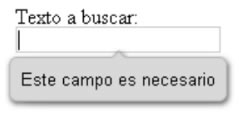
As we see, each browser shows different texts and designed differently: the basic idea is that people get used to the texts and design that "your" usual browser it shows them, deriving to it the validation functionality, thus uniformizing in all the sites that a user visits the validation messages.
As we can deduce, the posters and texts that each browser adds, can not be modified, unless we deactivate the validation in the complete form. This is so since the objective is that the experience of using a form is universal, unique to a person accustomed to a browser that will always show the same messages and in the same format.
Validations with regular expressions and patterns
In some form fields we will need to specify a pattern (or "pattern") that the data entered by the user must respect to be considered a valid data. For example, that the username has at least 5 characters, and that they are letters from "a" to "z". Typically regular expressions are used for this, and the pattern attribute precisely allows us to assign a regular expression as a condition for the validity of the data entered in a field.
Let's see a simple example:
<label> Nro. de Tarjeta de Crédito:</label>
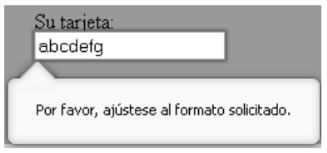
<input type="text" pattern="[0-9]{13,16}" />
Since the syntax of expressions regular is a technical issue of systems specialists, and exceeds what we can explain here, so we will simply say that this example allows only digits from 0 to 9 and in an amount between 13 and 16 digits to be entered in the field. inclusive. Otherwise, we will get an error message like the following:
New interface elements
So far, all the attributes that we have learned help us in the validation, but do not generate new ones Form elements. However, another of the major objectives behind the HTML5 forms is to be able to generate complex interaction interfaces (for example: calendar selectors for dates, hours, ranges of values, colors, etc.) without the need to use JavaScript libraries for it. And all this focuses on facilitating data loading in the case of users of touch screens (phones, tablets, etc.), where it is easier to "drag" or "choose" instead of writing.
In addition, in addition to generating new interface elements, the use of the new types of fields is associated with the type of data it will collect, the browser itself taking over from that moment to perform the necessary validation (as we saw above with the required attributes) or pattern).
HTML5 adds numerous new types of input specific to particular data types: that is, they are not new tags, but we reuse the same old input tag, but add new "types" (new values of the type attribute).
These new types of input are:
- Search (searches)
- Tel (phones)
- url (web addresses)
- Email (emails)
- Number (numeric)
- Range (ranges)
- Date (dates)
- Month (month)
- Week (week of the year)
- Time (time)
- Datetime (date and time)
- Color (colors)
Let's see next what are the syntax, the uses and the compatibilities of each of them.
Search
This type of input is the one indicated for a form where the user will write a text that will be sent to a search engine (internal or external to our site).
The syntaxis is:
<input type="search" />
Its visualization is the following:

Among the functionalities that this type of field incorporates, we can mention that it adds a button in the form of "x" "To" clean "the contents of the field; and that does not allow line breaks. If we paste a multi-paragraph text in the field, it will only take the word or phrase prior to the first line break, since it assumes that a search engine is used to search for a word or phrase, no more.
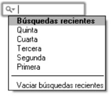
In Safari, the field of type search has the ability to define an exclusive attribute of that browser called "results", which allows you to indicate how many results of the last searches performed will be stored and displayed when you click on the arrow:
To achieve this, the necessary code would be:
<input type="search" results="5" />
In the case that an old browser does not know this type of input, it will degrade in an input of type "Text", so it will not affect at all the possibility of entering a text within the search field. Therefore, we can use it without risks right now on our sites.
Tel (telephones)
This type of input should be used for fields where we request that the user type their telephone (landline or mobile).
The syntaxis is:
<input type="tel" />
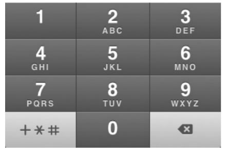
It is displayed just like a text input, but its use allows the numeric keypad to appear on a mobile phone, facilitating the entry of the number, as shown on the following keyboard. iPhone:
With respect to validation, it is impossible to unify an international criterion that allows to perform a validation of a telephone number (the number of characters, separators -scripts, spaces, brackets, parentheses- vary from country to country, so we believe that it will never be possible to validate the syntax of a phone automatically).
In the case that the browser does not support it, it degrades in a text input, so there are no problems to use it, you can insert the phone in any circumstance.
Besides the semantics that it adds and the advantage of linking to the numeric keypad in cell phones, it has the advantage of allowing from the style sheet to select all the inputs that are of this type, using attribute value selectors, with which we could decorate (Typically, with an icon in the form of a telephone) this type of field, without the need to add identifiers or classes, just for having been correctly marked with its type.
For example:
input[type=tel]{
	background:url(telefono.jpg) no-repeat center right;
}
URL (Web addresses)
When we need to ask our users to enter a URL, we can put this value of type to the input:
<input type="url" />
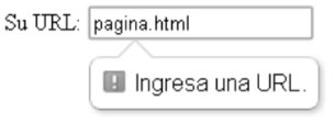
In this way, the browser will validate that an absolute URL is entered, that is, it starts with a protocol (typically, http: //) although any character is accepted before the colon and the double bar, which makes it compatible with the future with new protocols that may arise.
In case of error, it will show us a message:
One advantage of using this type of input is that users of many mobile devices have a special keyboard type for URLs, which includes point, bar and a button that writes ".com" when pressed, speeding up the loading of the address:
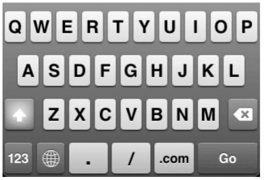
If it is not supported by the browser, it degrades in a text input, so you can also enter the URL without problems.
Email (mail box)
This type of input verifies that the box entered is valid (uses an international standard to verify validity: RFC 5322) but in spite of that, it does not guarantee the quality of the validation (it may be better to use a pattern , something that we will see later)..
Su uso es simple:
<input type="email" />
Its use is simple:
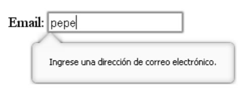
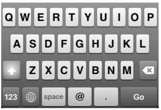
This time, the keyboard of an iPhone and the like will show the arroba character to facilitate the entry of an email box:
A variant of this type of input is that we can specify the multiple attribute, in this way:
<input type="email" multiple />
In this case, it will accept the entry of several boxes separated by commas and validate that each of them follows a correct syntax. With this variant, the message shown will be similar to the following:

Like all previous types of input that we have already seen, it degrades in a text input if it is not supported, so that its use will not generate any problem.
Number (numbers)
This type of input is very useful to allow quick entry or selection of numbers, thanks to the addition of a pair of arrows (ascending and descending) together with the field that facilitate the rapid entry of numerical data, especially in the case of the touch screen of a mobile or tablet. In addition, you can define a range of values, with its minimum and maximum allowed.
Its visualization is:

And its syntax:
<input type="number" min="0" max="100" step="10" value="50" />
Min is the minimum value which will be allowed to enter, max is the highest allowed value and step is not only the jump that will be given when the arrows are pressed, but it is also the limit to the allowed values (if step is 10, it will only allow multiples of 10, for that the default value of step is 1). Since already value is the value that will be selected input, as in any other input.
Not only allows you to enter digits from 0 to 9, but also decimal point, negative sign at the beginning and an exponent, such as: -12345.678e+90
Degraded in a text input in the case of not being supported, so there are no problems in using it.
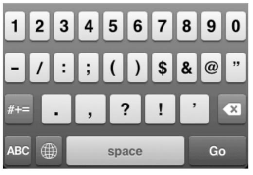
It has great utility to facilitate the entry of numbers on touch phones, allowing you to choose the number with a few taps instead of having to type it with the keyboard, or in case the cell phone includes it, showing only the numeric keypad on the screen.
Range (slider to slide and choose ranges)
EIt is similar to number, but we must use it when the accuracy of the number entered is not as important, but we are interested in increasing usability ( the ease of dragging with your finger on a touch screen).
It is displayed as follows:

And its syntax is:
<input type="range" min="0" max="100" step="10" value="50" />
What sends to the server as a value is a number, proportional to the advanced range with the selector knob within the total path defined between the min and max. For example, in the case of the previous image, you will be sending an 80 as the chosen value.
Degraded in a text input, but the ideal is to ensure its compatibilizador with some script of which we will mention later. It is ideal in the case of web applications where we can operate it in the manner of a slider that generates values through programming.
Date (calendar to choose a date)
This type of input is responsible for displaying a complete calendar, with only specify:
<input type="date" />
The visual result will be:
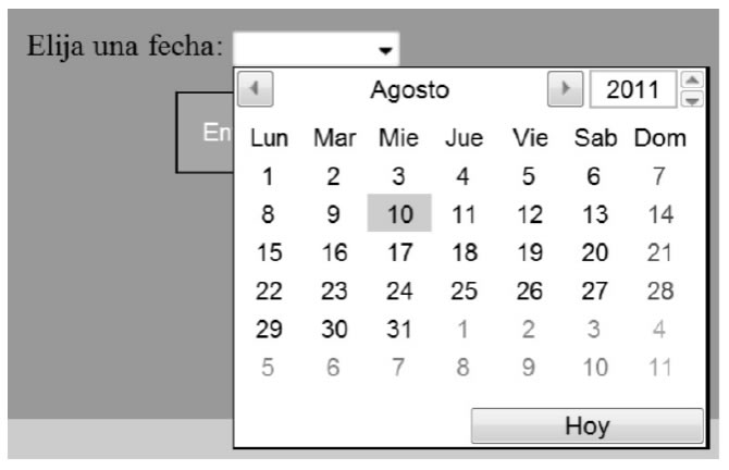
You can carry the min and max attributes to define a permitted range of dates to choose from and will not allow entering dates outside that range.
- A problem for users of countries that do not follow the North American format of dates, is that the format of the text that is written in the input in some versions of the Opera browser is 2018-09-21 (year, month and day, in that order) , which can lead to errors and confusion on the part of less experienced users. While in Chrome and Firefox, the format is what we are used to (day, month, year)
The format that you send to the server as the value of this field is the same one that we just showed (2018-09-21, year, script, month, script, and day). Then we must use PHP or some other server language to break down that string of characters into parts and be able to use it in more readable formats for us. It will be necessary for the programmer to consider that the received format may vary between one browser and another.
In the case that the browser does not support it, it degrades in a text field generating a problem for the user, since it will not know in what format the date should enter, for which it is unavoidable to use a compatibilizing script such as those that we will see later in this chapter.
- At the time of writing this book, Opera, Firefox and Chrome are the only browsers that support this type of control (the rest of date and time controls, and color selection controls, only work in Opera), so we do not recommend utilization without adding a compatibilizer script. A great advantage of the implementation of Firefox and Chrome, is that the order of the data to detect the location of the browser is changed to Day / Month / Year, for better understanding in the Latin American world
Month
It is similar to the previous one, but when clicking on any of the days of the chosen month, select the full month (we will see all the days of the month, as in the following screenshot).
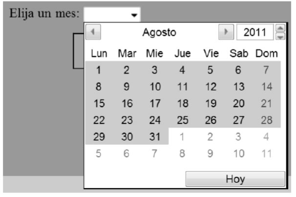
This is generated with the code:
<input type="month" />
The format of the text sent to the server (and which shows once the date is selected) is 2018-09 (year, script, month). Again, order is not familiar to our culture.
It supports the same min and max attributes as the other date and time elements.
It could be useful to enter, for example, the expiration month of a credit card.
Week (week of the year)
Probably the least used of all the fields related to dates, allows you to choose a week of the year by its order number:
<input type="week" />
Your result is:
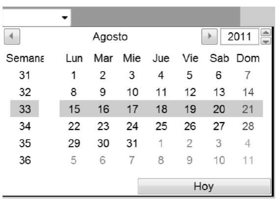
Selects an entire row (one week) and has an extra column at the beginning, which indicates the week number within the weeks of the year. Send to the server (and show once the week is chosen), a text with the format:
2011-W33 (year, script, a "W" and the week number)
Time (hour)
Used to indicate a time. Its syntax is:
<input type="time" min="11:30" max="23:30" step="600" />
And its appearance is:

Lead The same attributes as date. The value of the step is indicated in seconds (and defines how much will jump when you press the arrows, in addition to limiting the allowed minutes to those that are multiple of the specified step).
The format that shows and sends to the server this time does serve in our culture.
Datetime (date and time)
Allows you to select a date and a time at the same time.

The format in which the data will be sent is specified in UTC format:
- 2012-09-21T10:55:59.001-03:00
Degraded in a text field as well as date, being equally undesirable its current use, unless we depend on a compatibilizer.
Color selector
If in a web application we want to choose a color, we can use this type of control.
>input type="color" /<
For now, it is only supported by some browsers, but its version 11 onwards, and by Chrome in its version 21 and above, but compatibilizing scripts can be used.
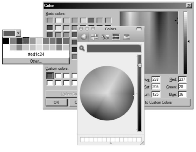
In principle, Opera displays a list with a few basic colors, but if we click on "Other" it opens a color selector from where we can add new colors to the palette. In the case of Chrome, it directly opens the color selector when you press the control. What it will send as input value is the hexadecimal code of the chosen color.
Datalist
This new HTML element is used in combination with a text input (or similar, URL type, email, etc.), where the user is expected to write. It works in the manner of an auto-suggest, that is to say: as the user writes a letter and there are coincidences between what was entered by the user and some of the predicted values, it shows them displayed below the field, so that we can select them with the mouse, or with your finger on a touch screen.
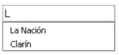
Its main use is to facilitate the loading of "majority" values, that is, 80 or 90 percent of users will surely choose, but allowing writing unanticipated values. For example, if we consider the options included in "breakfast drink", surely many will opt for coffee, others will choose tea, and so with 6 or 7 common options, while a few will enter some other drink not included in the list.
For those cases, this label would replace a select with options, which in turn had an extra text field next to it with the option to enter "Other" data not included in the Select list. That is, the user is not obliged to choose one of the options provided, they only serve as help to ease the load in most cases, but they are allowed to write something different from what was planned, and the field will accept it.
First we create the text field:
<input type="url" name="diario" list="sugerencias" />
And then we assemble the list of options inside a datalist tag (if there are few options we can write them by hand, although typically these values can come from a query to a database made with a language like PHP):
<datalist id="sugerencias">
	<option label="La Nación" value="http://www.lanacion.com.ar"></option>
	<option label="Clarín" value="http://www.clarin.com"></option>
	<option label="Página 12" value="http://www.pagina12.com.ar"></option>
	<option label="Infobae" value="http://www.infobae.com"></option>
</datalist>
To that datalist tag it is essential that we place an id ( identifier) since it is the one that we must specify in the previous text field within its "list" attribute, to link to that field with this list.
As we see, the structure of each option is not the same as that of the option of a select: in a select, each option wraps the visible value and can carry a value that is the data that will be sent to the server as the value of that chosen option . In contrast, in the options of a datalist no value is wrapped, but two attributes are specified: label and value. Within the label is where the match will be searched as the user writes, but what he says in the value is what will be sent.
We can also make both attributes (label and value) equal, so we could link it to a simple text input to facilitate the loading of the chosen options:
<datalist id="sugerencias">
	<option label="La Nación" value="La Nación"></option>
	<option label="Clarín" value="Clarín"></option>
	<option label="Página 12" value="Página 12"></option>
	<option label="Infobae" value="Infobae"></option>
</datalist>
At the moment, only Firefox correctly implements the datalist natively; in the rest of the cases, we will use some compatibilizer.
CSS for forms
While we are still in the stage of the book on HTML markup, there are some developments in CSS3 related to the forms, so we think it is appropriate to include them at this time. These are some of the new CSS3 pseudo-classes that facilitate the decoration of form field states, or validity status of your data.
We can detect if the data entered is valid (or not) and decorate the field accordingly (with a color, border, background image, etc.) with the following pseudo-classes:
-Focus: applies during the time in which That input is making you focus:
input:focus {
	background-color:gray;
}
-Invalid: it is applied while the content of the field does not comply with the validation rules defined in a pattern, or if it is not a valid email:
input:invalid {
	color:red;
}
-Valid: the defined is applied as long as the content is valid according to the applied rules, inversely to the previous case.
input:valid {
	color:green;
}
-Required: applies if the field in question has the attribute "required":
input:required {
	border: 3px solid #F00;
}
-Optional: on the contrary, we can select all the fields that do not have the "required" attribute applied by means of the "optional" pseudo-class:
input:optional {
	border: 3px solid #999;
}
Keep in mind that in the fields of type "search", neither Chrome nor Safari allow us to modify the borders when applying "optional" (although they do allow to modify the color of the texts).
-In-range: when we need to point to a numeric field or dates, while its value is within the range defined by the attributes "min" and "max", we can use in-range:
input:in-range {
	color: gray;
}
-Out-of-range: on the contrary, to point when the value is outside the defined range, we will use out-of-range:
input:out-of-range {
	color: red;
}
-Read-only: to point to controls that have the "readonly" attribute defined (read only, similar to the old "disabled", but with the difference that they will send their content to the server when the form is sent):
input:read-only {
	border: 3px solid #F00;
}
-Read-write: complementary to the previous one, to point to the fields that do not have the defined "readonly" attribute:
input:read-write {
	border: 1px solid #000;
}
We can also combine two or more of these pseudo-classes, to create more complex conditions or "states". For example:
input:focus:required:invalid {
	background-color: #f00;
}
That will only apply to an input that is receiving the focus (because it was clicked or reached with the tabulator), that it is a required field and that, in turn, the content entered so far is not valid.
CITE ARTICLE
For homework, research, thesis, books, magazines, blogs or academic articles
APA Format Reference:
Delgado, Hugo. (2019).
HTML Forms - Examples and styles with CSS for controls.
Retrieved Nov 11, 2025, from
https://disenowebakus.net/en/forms-html


