The information architecture of a Site and Web Usability
The information architecture works on the structural design of information systems, organization, recovery and intuitive presentation of data.
Few technological advances have had an impact similar to the web in the history of mankind. In less than a decade, it has become a practically indispensable means of communication and the main source of information for an important part of the world's population. The web, with more than one billion pages, only in its indexed public part, without even considering the hidden website1, is quickly becoming the indisputable option in which to look when someone has a need for information.
Such large amounts of data require methods that allow efficient delivery to users. The field of work of web development has evolved rapidly, taking notions of a series of professions and diversifying into different specialties. In the present article we will describe some of the disciplines that focus on optimizing access to information. In this way we detail the two main areas of web development: information architecture and usability. Next we present a causal model that relates both and others that allow to evaluate and improve the design of a website.
Information architecture
The information architecture (AI) deals with the structural design of information systems, its central problem is the organization, recovery and presentation of information through the design of intuitive environments. This discipline was born at the end of the 1990s as a response to the explosion in the size and complexity of information systems based on the Internet.
The IA has a close relationship with the librarianship; taking advantage of the knowledge established in terms of organization and information management and delving into the areas of categorization and metadata.
It is comparable to the traditional architecture of public spaces: it consists of the creation of the plans that the builders will use to erect zones that will be visited daily by hundreds of people. As in all public spaces, a large part of the visitors that enter them do so for the first time. This implies that the learning of navigation in this place must be highly intuitive. The biggest difference between traditional architecture and information architecture is that digital spaces are intangible, the designer must supply the lack of specific references for orientation with visual cues on the screen (Fleming, 1996, Foltz 1998).
The AI also has a close relationship with librarianship; taking advantage of the knowledge established in terms of organization and information management and delving into the areas of categorization and metadata. The indexing, categorization and description of the specimens in any type of collection will have a great impact on their recovery and administration (Rosenfeld, Morville, 2002, chapter 1, Wodtke, 2002, chapter 5). It uses the advantages of technology applied to the information sciences to enhance access to digital documents (Tramullas, 2000). An example is the sites that use faceted classification to access content, offering great flexibility to users with different tastes, interests or needs (Instone, 2004).
It is difficult to achieve consensus regarding the definition of AI, therefore, one of the most accepted meanings is multiple:
- The structural design of shared information environments
- The art and science of organizing and labeling websites, intranets, online communities and software to support usability and usability (the ability to search and find a site)
- An emerging community of practice focused on the application of design principles and architecture in the digital landscape
In this definition, the reference to "art and science" is also striking. What this phrase means is that the IA requires both rigor and precision as well as creativity, talent and experience. The AI professional must be both a scientist and an artisan.
Following the definition agreed by the founders of AIfIA, special importance is given to the organization and labeling of the systems. The organization of information is the central subject of librarianship. The labeling consists of putting a name or label to each of the elements of the classification, to the categories. It also involves putting titles to each page and giving names to all the buttons that perform an action in the system. All of them must be described in the language of the users and they will retain a certain consistency, forming part of a single system (Rosenfeld, Morville, 2002, chapter 6, Wodtke, 2002, chapter 5).
AIfIA also incorporates in the second point the design of the software to which it is part of the information systems, it is an inclusive definition that includes all the dimensions described by Garrett in his model "the elements of the user experience". It is under this broad notion of AI, which covers elements such as information design and interaction design, that we propose the present article and its final model.
The AI also works with controlled vocabularies and thesauri. The use of semantic relationships for the association of elements offers great advantages for electronic commerce, since it allows the creation of relationships between complementary products. Controlled vocabularies also have a great impact on the effectiveness of search systems, by incorporating variants, synonyms and errors of writing as equivalence (Rosenfeld, Morville, 2002, Wodtke, 2002, chapter 6).
During its first wave of evolution, web development tended to focus on the technological dimension of systems, but the recognition of the human aspects of information models is now increasingly a fundamental part of its success. Many companies that start in web development tend to force terminology and internal organization of the company in their systems and sites; It is the language they use daily and it is natural for them to describe their contents and tools. They then receive a number of calls from people who are unable to find information that is actually available, but hide behind their own internal organization and language. When the site is organized and labeled according to the mentality and language of the users, the results improve remarkably: "The secret of making a site that people like is to involve them in the design process" (Wodtke, 2002, Chapter 4).
1. Interation Design
It defines the behavior of the devices and tools that we use daily. All the technological devices that surround us have their own interaction design (Cooper, 1999, chapter 1, Krug, 2000, chapter 1, Garrett, 2002, chapter 1). We can see it easily when comparing similar devices from different manufacturers: sound equipment, video, mobile phones, cars, etc. The way in which these gadgets offer us access to their different functions is always the product of the people who design them. When it has been designed with its users in mind, we do not think about its operation: we simply use it (Krug, 2000, chapter 1). If we have trouble understanding how to use it, it usually means that it was designed without much study about the end users and their needs (Cooper, 1999, Chapter 4), according to the characteristics of computers and humans for the design of the interaction.
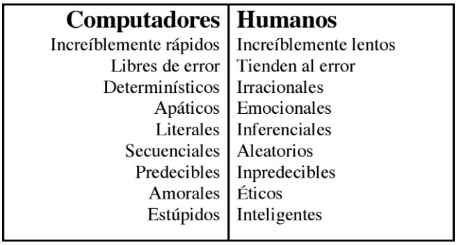
To create interaction with applications, and to be intuitive, they must be designed according to the mental structures and language of the users (Wodtke, 2002, chapter 7); This is achieved through a series of methods that incorporate user research as a central part of the design process.
In abstract terms, the behavior perceived by the user in the interaction with the system should be courteous and friendly. A well-designed functionality puts the machine to work and not the person (Cooper, 1999 chapter 10) and uses the best of both worlds to design the meeting point so that the user is satisfied with the use of the system (Krug). , 2000, chapter 1).
Interfaces design
It seeks to organize each page or screen of the system as clearly as possible. In this area, the key is to prioritize through contrast (Tufte, 1990, Wodtke, 2002, chapter 8). Restrictions on the size and resolution of screens leave no room for subtlety (Tufte, 1990), all elements must be arranged in a clear visual priority that facilitates their understanding.
The interfaces of a website should normally gather elements common to the structure of the site (eg, global navigation systems) with particular components of each page (Rosenfeld, Morville, 2002, chapter 7). Once again, knowing the needs, language and mental structures of the users will be fundamental for the success of the design (Wodtke, 2002, chapter 4).
Web Usability
Part of the great success of the web has been the ease of publishing content. The main language of writing pages, the html, is easy to master. It does not take specialized training to start publishing complete websites. As pages are such an important element for millions of people, it is vital that sites are easy to use and adequately meet the needs of users.
When the site is organized and labeled according to the mentality and language of the users, the results improve significantly.
However, it's not always like that. On many occasions, the sites become de facto obstacles between the user and the source of information. One of the reasons why this may happen is because the authors of the pages have developed them without taking into consideration the minimum principles that ensure that the document is used to its fullness. They have not elaborated considering its usability.
What is Usability?
In accordance with ISO 9241 (Ergonomic requirements for visual display terminals, 1998), part 11 (Guidance for usability) is defined as the range in which a product can be used by a group of specific users to achieve certain defined goals. effectiveness, efficiency and satisfaction in a context of specified use3. Usability is the perception of how consistent, organized, efficient, productive, easy to use and intuitive is the process of completing a particular task within a system.
Bennett (1979) was the first to use the term to describe the effectiveness of human performance. Shackel (1991) defined it as "the capacity of something to be used by humans in an easy and effective way, where:
- easy = is a specified level of subjective satisfaction
- effective = is a specified level of human performance "(Galitz, 2002)
According to Brinck et al., (2002) usability is defined as the degree to which people (users) can perform a series of required tasks; Rosson and Carroll (2002) understand it as the quality of a system with respect to ease of learning, use and user satisfaction. One of the more practical definitions is offered by Krug (2000): "After all, usability really means being sure something is working well: that a person with average (and even below average) abilities can use one thing (already be a website, a jet fighter, or a revolving door) for your intended without ending up hugely frustrated".
The usability is not limited exclusively to computational elements (just remember the infamous buttons to program the video, where practically it was required to take a course to use the function), but it is a concept applicable to any type of interface. As a study area, it is part of the field of human-computer interaction4 and its objective is to determine whether a system satisfies the needs of the user or not.
It is a concept that encompasses a series of metrics and methods that seek to make a system easy to use and learn. This part is part of usability engineering. It is a discipline that provides structured techniques to achieve an optimum level of usability in the design of a user interface during the development process.
It is important to note that usability is a process that is applied to all the elements with which the user can interact, including aspects of installation and maintenance of the system, if we refer to software products. To ensure its existence we must take into consideration the following points:
- The motor, cognitive and perceptual abilities (and limitations) of people
- The special and unique characteristics of the population of target users of the application
- The unique properties of the physical, technical and corporate environment of the users
- The unique characteristics and requirements of the users' tasks, which are supported by the site or application
Usability has five defined attributes (Nielsen, 1993):
- Ease of learning The system must be easy to learn, in such a way that the user can quickly start using it.
- Efficiency. It must be efficient in its use, so that when learning to use it the user has a high level of productivity.
- Retention over time. Its use will be easy to remember. If a user stops using it for a while, regain an acceptable level of understanding (where he was and what he was doing) once he returns to using the application should be a simple task.
- Error rates by users. How often the user makes mistakes and how severe they are. Obviously, the system must have a low error rate, so that as few mistakes are made as possible. And in case they occur, there will be the necessary facilities to provide a solution.
- Subjective satisfaction How pleasant is the use of the system for users; if they feel subjectively satisfied when using the system; if you like it
A well-designed functionality puts the machine to work and not the user.
The following attributes are also suggested to ensure the usability of a product (Cato, 2001):
- Control. Users should feel that they have control over the application, and not the other way around.
- Skills. They should have the feeling that the system supports, complements and enhances their skills and experience (has respect for the user).
- Privacy. The system helps them protect their information and / or that of their clients
How do we test the usability of a website?
The usability of an application can be something really difficult to determine. One of the reasons is the complexity of the processes involved: the behavior of the user and the system. In 1998 Lund mentions that useful metrics did not exist (at the time of writing the article). In a work on usability studies published by ACM / Sigchi (Frokjaer, 2000) it was shown that the components that are regularly measured (effectiveness, efficiency and satisfaction) are not strongly correlated and are not consistently collected.
Today, the landscape in terms of metrics is still very limited. There are quantitative factors to measure when doing a usability test (for example: the time required to complete a particular task), but definitely many of the factors to be evaluated in a system, (speaking of usability) are qualitative. In any case, a test can dramatically improve a product (either web or not) by detecting problems that affect its full use.
Usability tests have been applied extensively in the industry to evaluate the prototypes of a system at different fidelity levels. The main objective is to derive a list of usability problems based on the observations of evaluators and on the analysis of users, both verbal and non-verbal behavior (Lai-Chong, 2004). Once problems have been identified, the developers of the application proceed to make the corresponding adjustments.
There are several techniques to evaluate a web application: from very simple to highly sophisticated. They can be done both in controlled environments and in the place where they will be used; an automated evaluation can be done, or carried out by real users. In reality, everything depends on the resources available at the time of committing it. It should be noted, in any case, that usability tests are expensive in terms of time and personnel required to perform it.
The most common type of tests are those of high-fidelity prototypes, also known as end-product tests (Spool, 2004); they are made in products that are in their last phase of development, practically ready or already in use. Any major problem detected is fixed in the next version of the product.
Usability tests have been applied extensively in the industry to evaluate the prototypes of a system at different fidelity levels.
Below are briefly three categories of usability tests (automated, expert and real users)
Automated test
Using an automatic evaluation system we can identify aspects such as broken links, ensure the portability of the website (which is equally useful in different browsers) or that the alignment of the text is correct, to mention a few points. Even, it is possible to simulate the activity of a user (creating a model for that purpose) when interacting with some of the functions of the system (for example, testing its robustness by writing text in web forms).
Test with real users
The application, web or not, can be evaluated using users. It is one of the best ways to measure usability because, although the model created during an automatic usability test is very good, it is difficult to achieve the levels of unpredictability of a human being.
You can perform tests with real or expert users. The first ones are chosen in such a way that they represent the most reliable way to the people to whom it is addressed (for example, if it is a banking application to carry out different transactions, a group of people representing different types of clients is chosen. they could use them). The actions of the test users when interacting with them are monitored, and possibly recorded, for further analysis.
The usability tests, in which the aloud thinking technique is the one typically used, have become the de facto evaluation method.
Test with expert users
Expert users contribute by detecting errors, basing their opinions on their own experience. They can be graphic designers, webmasters, cognitive psychologists, software engineers and, in general, professionals with the sufficient qualifications to be able to emit a valid judgment on the application. Generally, tests with expert users involve touring the website, trying to emulate what a common user would do in it. As the exploration is carried out, annotations are made about problems detected and alternatives are proposed for their solution.
They involve the following activities (Shneiderman, 2004):
- Heuristic evaluation. The system is verified against a small set of design heuristics
- Review of standards (guidelines). It is checked to see if it complies with the rules followed by a particular organization (for example, if the interface complies with the guidelines of a certain company's style)
- Consistency inspection. The experts control the firmness through a family of interfaces, verifying the solidity in the terminology, types of letters, color schemes, layout of the screen, input and output formats, etc. It is possible to use software tools to be part of these tasks
- Cognitive walk (cognitive walkthrough). The experts simulate the behavior that a user would have when making use of the system in everyday situations
- Formal usability inspection. The experts hold a discussion session, with a moderator or judge, where the interface is presented and its merits and weaknesses are discussed
Additional resources
Additional information on usability can be found in Baeza-Yates and Rivera, 2003 and:
- Chauncey Wilson, of BMC Software, maintains a list of specialized bibliography on usability, human factors and other areas related to the IHC. It has comments in English of each listed title. This document can be viewed online and it is also possible to subscribe to a mailing list to receive notifications of updates
- Usability Toolbox offers an extensive list of references on classic usability issues, including comments to a large number of books on the subject. Some of the resources shown on this website have not been updated, but it is definitely a good starting point to enter this field
The AI feeds on both the expected and demonstrated needs through usability evaluations and log analysis.
A website in Spanish with information relevant to the area of usability and information architecture is Design and architecture of information, which presents, among other materials, a complete bibliography related to the subject. Special mention deserves a pdf document available on the same site, where the author, Jesus Tramullas, offers a personal critique of some of the most prominent texts on the subject. In this same site is available the article "Proposals for usability analysis for web sites", of an introductory nature, and includes a series of proposals on their types of techniques and their application to websites.
Information architecture and usability: a causal model
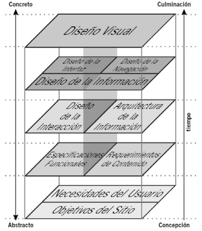
A model is needed to integrate and represent the relationship between these two areas of web development and how they converge in the production of websites. We propose the following model:
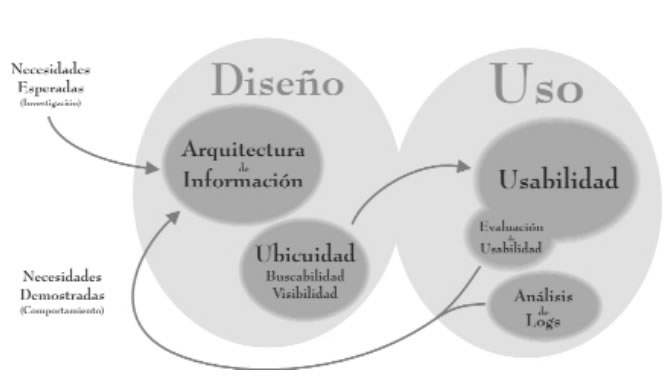
The difference and relationship between information architecture and usability is a frequent question in this field. Our proposal shows the relationships between these fields of work as part of a cyclical process, feeding on research with users in different stages.
The projects are designed thinking of a user model and the experience that it would have when using the system. However, the true result can not be known until real users confront it. That is why at a first level the model presents this duality between design and use.
In the dimension of design are information architecture and ubiquity. There is no ubiquity without information architecture and only if the site is ubiquitous on the web, it can be used. In the use dimension, usability and its evaluation appear, as well as the activity log in the logs for analysis.
In this model, we use a broad notion of AI, covering both the content and functionality branches and the information design. The AI feeds on both the expected needs (found through research), and those demonstrated through usability evaluations and log analysis.
The ubiquity of a website is related to its capacity and probability of being found. The ability to search and find content on the site (searchability), both for a search engine and for a person, and to be downloaded and deployed properly in the browser application (visibility) will depend on technical characteristics in the construction of the pages that form it, and is related to the adherence to established standards for the web (Baeza-Yates, 2003).
As we have already seen, usability is a measure of the quality of the user experience on the site, combining quantitative and qualitative variables, being measured at different stages of the project with various tools.
As we have already seen, usability is a measure of the quality of the user experience on the site, combining quantitative and qualitative variables, being measured at different stages of the project with various tools.
Conclusions
Some of us have been able to experience, for more than a decade, the different stages of the web. In its beginnings, the designers were facing a territory without rules and without major considerations of usability. Later, with a greater availability of new technologies, many professionals began to integrate them into their sites without considering whether they really improved the user experience.
The stage in which we are now considers the user as the fundamental element of success. Finally, if you can not use the system, would there be any justification for investing in money, time and development personnel in its implementation? The answer is no.
A well-designed system with the participation of users will make them feel skillful and powerful, they will understand it naturally and will not require further analysis to learn and execute their operation, achieving the goals that led them to use it.
If, at the theoretical level, it is difficult to establish the limits that separate the architecture from the information of usability, in the practical field this becomes even more complicated. Among practitioners, both branches inevitably cross each other; the same happens with the discussion spaces, both digital and physical.
Both disciplines are intimately related and only a handful of consultants have reached such a level of specialization that they move exclusively in one of these fields. Currently, most information architects also exercise the field of usability. Even in relatively small markets there are very few who can dedicate themselves exclusively to this area: it is usually the designers and project leaders who must incorporate the methods of information architecture and usability to improve the quality of their results.
Currently the disciplines of information architecture and usability are growing every day to go out to defend common users, offering greater flexibility and clarity for the use of technological systems.
CITE ARTICLE
For homework, research, thesis, books, magazines, blogs or academic articles
APA Format Reference:
Delgado, Hugo. (2019).
The information architecture of a Site and Web Usability.
Retrieved Nov 11, 2025, from
https://disenowebakus.net/en/information-architecture

