Place CSS div Absolute, relative, fixed & floating position
CSS allows to release the elements of the normal flow of the document and position them at will with absolute, relative, fixed and floating properties.
The block elements always generate a new line and are ordered one below the other, the inline elements do not generate a new line and they are ordered side by side.
That ordering is what is also known as static positioning.
CSS also offers us the possibility of releasing the elements of the normal flow of the document and accommodating them at will.
Absolute position
The absolute position frees the element from the normal flow of the text. That element is then above all other elements and has no influence on the position of the elements within the design.
The absolute position is defined by the values left, top, right and bottom, which are calculated with respect to the margins of the parent element - provided that the parent element has some type of position. If a positioned parent element does not exist, the <body> element is taken as the parent element.
<div style="margin: 10px 0 0 10px;">Element block normal 1 </div>
<div style="margin: 10px 0 0 10px;">Element block normal 2
<div style="position:absolute; top:0; left:0;">
Block element with absolute position 3 </div>
</div>
<div style="margin: 10px 0 0 10px;">Element block normal 4 </div>
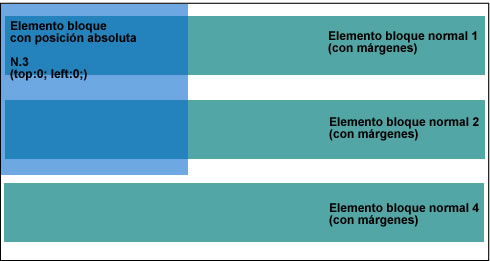
Element with absolute position within a non-positioned parent element
<div style="margin: 10px 0 0 10px;">Normal block element 1</div>
<div style="position:relative; margin: 10px 0 0 10px;">
Block element with relative position 2
<div style="position:absolute; top:0; left:0;">
Block element with absolute position 3</div>
</div>
<div style="margin: 10px 0 0 10px;">Element block normal 4</div>
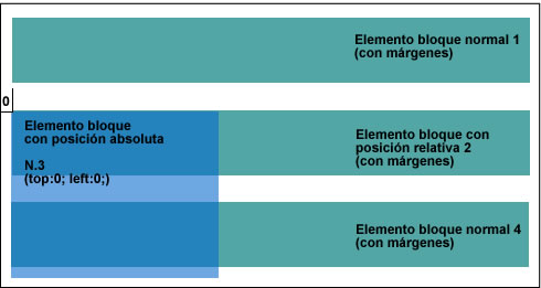
Element with absolute position within a parent element with relative position
The elements with absolute position are anchored in their starting position (defined) and move on the screen with the normal movement of the content of the page.
The positioned elements may overlap each other. We can give the "heap" the order we want with the help of the z-index property.
#menu {position: absolute; z-index:10;}
The number defines the position within the "heap", with 0 being the lowest position. If the same value is defined for several elements, the order of the document tree prevails.
Relative position
This property is defined from the normal, or initial, position of the element, and does not release it from the text flow. Giving values to left, top, right or bottom, the element moves with respect to its initial position, but the elements that follow it do not change its behavior.
This value is often used to give a new reference point to descendant elements with absolute position.
Fixed position
This property has the same conditions as absolute, but with one difference: the element remains fixed in its screen position and does not move with the rest of the page.
Float
This property is one of the most elegant, but one of the most difficult to use and control within the CSS design technique.
Float means "float", which only partially describes the property, since it is rather the text that is floating around the floating element.
All the elements can be floating. When converting them, each element automatically becomes a block element to which all the typical properties of these elements can be assigned.
One of them, the width, is essential. If that feature is not specified, browsers will interpret it in different ways, sometimes taking the width of the content, sometimes the surrounding element.
The floating element is erased from the normal text flow and, unlike the elements with absolute position, it is positioned directly after the preceding block element. At the same time, it is aligned on the right margin, or left, according to its initial position.
The position in the source text also determines the starting point of the floating element, which will then extend over the parent element, just like the elements with absolute position.
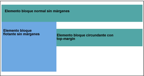
Floating elements and parent elements
All the surrounding elements happen to surround it on the opposite page. The rules that apply when aligning the element to the left or right are quite complex and not always evident, since they are often closely related to the relation that the surrounding element keeps.
To demonstrate what has just been said, a small selection of rules on floating elements aligned to the left is presented below (valid analogously for elements aligned to the right):
- The floating element must be aligned as high as possible
- The floating element should be aligned as far to the left as possible
- The left edge of the floating element cannot be aligned to the left of the surrounding block
- The right edge of the floating element cannot be aligned to the right of the left edge of a floating element on the right
- If there are other floating elements to the left above, the left outer edge of the current floating element must be either to the right of the outer right edge or with the upper edge below the lower edge of the preceding floating element
It is clear that if we work with float we will find a lot of complications. However, this property is one of the most important within the CSS design, since it allows great flexibility. Therefore, it is worth acquainting yourself with their conditions.
For this we will leave behind the confusing world of rules and focus on a few practical examples. Let's start with a simple element that will float in an independent box along with the surrounding text:
<p>Normal block element without margins</p>
<p style="float:left;">Floating block element without margins</p>
<p style="margin-top: 10px">Surrounding block element with top-margin</p>
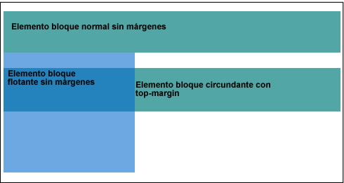
Simple floating element
Here we can see that the floating paragraph is aligned to the left, immediately following the lower edge of the preceding element.
If the preceding element has a distance defined with respect to the following element (in the following example, a margin-bottom), the lower edge moves that distance:
<p style="margin-bottom: 10px;">Normal block element with margin-bottom</p>
<p style="float:left;">Floating block element without margins</p>
<p>Surrounding block element without margins</p>
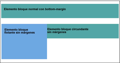
Floating element and distances
Note that the surrounding block element does not align next to the floating element. Only the line boxes of the surrounding element are reduced to leave enough space for the floating element. This causes the surrounding text to "adhere" directly to the floating element.
Nor will it be helpful to assign a padding-left to the surrounding text, since this would refer to the left edge and, therefore, would be behind the floating element.
To force a distance from the surrounding text, you must explicitly assign a margin to the floating element, for example like this:
<p style="margin-bottom: 10px;">Normal block element with margin-bottom</p>
<p style="float:left; margin: 5px 20px 0 10px;">Floating block element with margins</p>
<p>Surrounding block element without margins</p>
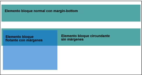
Floating element with own margins
The margin enlarges the floating element box, and the line box of the surrounding text is reduced in the same proportion.
In the figure we can clearly see that the block box of the surrounding element occupies, effectively, the entire width of the parent element and is not aligned with the floating element.
To align several floats next to each other, follow the same rule:
<p>Block element without margins </p>
<p style="float:left;>Floating block element without margins</p>
<p style="float:left;>Floating block element without margins</p>
<p style="float:left;>Floating block element without margins</p>

Several floating elements aligned to the left with jump
The other elements aligned to the left that no longer fit on the first line, will suffer a jump and will be floating on the next line, aligned on the lower edge and right outer edge of the preceding.
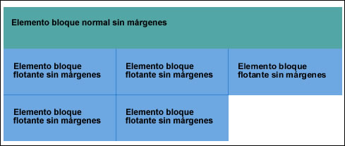
Several floating elements of different heights aligned to the left.
In this state of things, the degree of complexity that can be achieved is really great, for example when we have several elements of different heights, in that case, the alignment that is assigned ne can be completely disrupted:
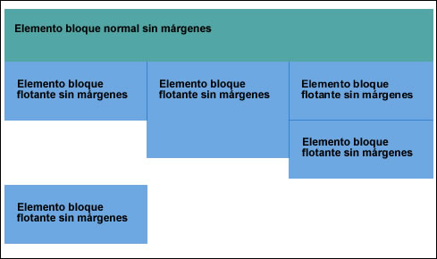
Floating elements of different heights aligned to the left
Of course, another alternative is to let some of the elements float on the opposite page:
<p>Normal block element without margins</p>
<p style="float:left;">Floating block element without margins</p>
<p style="float:right;">Floating block element without margins</p>
<p style="margin-top: 10px;">Block element surrounding with top-margin</p>

Two opposing floating elements
In these alignments the same rules apply as in the previous examples. However, it should be noted that when several opposing elements are used, that is, for example several elements aligned to the left and several aligned to the right on the same line, some browsers may get to sweat when they have to represent them. That is why it is essential to always check in detail how browsers behave.
Clear - finish floating
With the clear property, the normal flow of the document is restored.
This means that the float and clear properties have opposite effects: float influences the tables that follow, while clear refers to the preceding tables, that is, cancels the float effect in them. Therefore, it is perfectly possible to simultaneously assign both properties to the same element.
The clear property can adopt the values left, right, and both, depending on whether we want to end a floating element aligned to the left, to the right, or to floating elements of both types.
The following elements surround the total height of a floating element. But the situation could arise in which we do not want the following text not to be shown around the floating element, but below it.
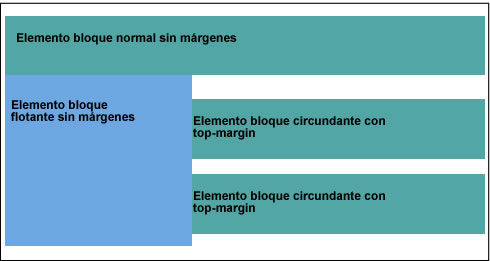
Several surrounding block elements
Suppose that the last surrounding of the figure should not be next to the floating element (it should not circulate) but we want to position them again within the normal flow of the text, below (below) the floating element.
Let's see what would happen if we wrote the clear property for the last block element:
<p>Normal block element without margins</p>
<p style="float:left;">Floating block element without margins</p>
<p style="margin-top: 10px;">Surround block element with top margin</p>
<p style="margin-top: 10px; clear:left;">Surround block element with top margin</p>
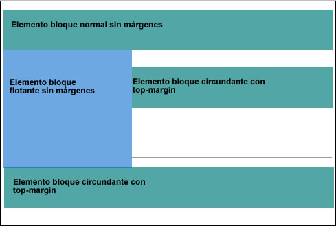
Simple application of clear in the following element.
The element is displaced, as we wanted below the floating element, but remains attached to its lower edge, despite the defined margin-top (underlined in the image with an additional line). The upper margin of the frame marked with clear has been lengthened until it can be aligned below the floating element. The browser performs that extension automatically, according to the defined value.
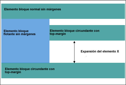
The element with the clear property is extended.
To be able to control everything better, the clear property can be expanded in several ways. The most common is to use an element, otherwise empty, and thus cause the parent element to expand:
<p>Normal block element without margins</p>
<p style="float:left;">Floating block element without margins</p>
<p style="margin-top: 10px;">Surround block element with margin-top</p>
<div style="clear:left;"></div>
<p style="margin-top: 10px;>Surrounding block element with margin top</p>
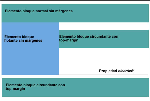
Enlargement of the parent element by means of an empty element
A solution undoubtedly surprising, and only necessary when the contents are continuous to the element floating are not higher than the element;.. but entirely within the spirit of the specifications often no element (vacuum) is not required but simply apply clear to a rear element, such as footer.
In principle it can be said to work with any element released from the normal flow of text by absolut ute or float, brings with it certain difficulties and risks. Therefore, use these elements with caution, carefully observing their behavior, until you feel that you can really control them.
CITE ARTICLE
For homework, research, thesis, books, magazines, blogs or academic articles
APA Format Reference:
Delgado, Hugo. (2019).
Place CSS div Absolute, relative, fixed & floating position.
Retrieved Nov 17, 2025, from
https://disenowebakus.net/en/position-div-css
