Psychology and color theory - What effects produce
We know more feelings than colors. Each color produces different effects that are often contradictory. The same color can act differently.

Color is not a characteristic of an image or object, but rather a subjective appreciation of ours
It can be defined as, a sensation that occurs in response to the stimulation of the eye and its nervous mechanisms, by the light energy of certain wavelengths.
People who work with colors - artists, therapists, graphic designers or industrial products, interior architects or fashion designers - should know what effect colors produce on others.
Each of these professionals works individually with their colors, but the effect of them must be universal.
Some studies show that colors and feelings do not combine accidentally, that their associations are not matters of taste, but universal experiences deeply rooted from childhood in our language and our thinking.
Psychological symbolism and historical tradition allow us to explain why this is so.
Creativity is composed of a third of talent, another third of external influences that promote certain skills and another third of knowledge acquired on the domain in which creativity is developed.
Who knows nothing of the universal effects and the symbolism of colors and relies only on his intuition, will always be outdone by those who have acquired additional knowledge.
If we know how to use the colors properly, we will save a lot of time and effort.
What effects produce the colors?
What is a chromatic acorde?
We know many more feelings than colors. Therefore, each color can produce many different effects, often contradictory.
The same color acts on each occasion differently. The same red can be erotic or brutal, untimely or noble.
The same green may seem healthy, or poisonous, or tranquilizing. A yellow, radiant or hurtful.
To what are so particular effects due? No color appears isolated; each color is surrounded by other colors. In an effect several colors intervene-a color chord.
A chromatic chord is composed of those colors most frequently associated with a particular effect. Some research shows that the same colors are always related to similar feelings and impressionss.
For example, the same colors are associated with animation and animation, as with activity and energy. To fidelity, the same colors as to trust.
A chromatic chord is not an accidental combination of colors, but an unmistakable whole.
As important as the most named isolated colors are the associated colors. Red with yellow and orange produces a different effect than red combined with black or violet; the effect of green with black is not the same as green with blue.
The chromatic chord determines the effect of the main color.
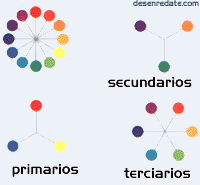
The chromatic circleThe chromatic circle helps us to observe the basic organization and the interrelation of colors. The primary colors are: red, blue and yellow. The secondary colors are: green, violet and orange. and tertiary colors are: violet red, orange-red, orange-yellow, green-yellow, blue-green, and violet-blue. Secondary colors are obtained by mixing equal parts of two primaries; tertiary colors are achieved by mixing equal parts of a primary color and an adjacent secondary. Primaries are colors that are considered absolute and can not be created by mixing other colors. However, mixing the primaries in different combinations creates an infinite number of colors. |
 |
The tone
It is the hue of the color, that is to say the color in itself, it supposes its chromatic quality, it is simply- a synonym of color. It is the quality that defines the mixture of a color with black and white. It is related to the wavelength of its radiation. According to its tonality it can be said that a color is red, yellow, green ...
Here we can make a division between:
- Warm tones (red, yellow and orange): those that we associate with sunlight, fire ...
- Cold tones (blue and green): Cold colors are those that we associate with water, moonlight...
Brilliance
It has to do with the intensity or level of energy. It is the luminosity of a color (the ability to reflect white), that is, the brightness. Refers to the lightness or darkness of a tone. It is a variable condition, which can fundamentally alter the appearance of a color. The brightness can vary by adding black or white to a tone.
Saturation
It is related to chromatic purity or lack of dilution with white. It constitutes the purity of color with respect to gray, and depends on the amount of white present. The more saturated a color is, the purer it is and the less mixture of gray it has.
What are psychological colors?
Color is more than an optical phenomenon and a technical medium. The theorists of the colors distinguish between primary colors-red, yellow and blue-secondary colors, orange and violet, and subordinate mixture, such as pink, gray or brown.
They also argue about whether black and white are true colors, and generally ignore gold and silver - although, in a psychological sense, each of these thirteen colors is an independent color that can not be substituted by any other, and all present the same color. same importance.
The rose comes from red, but its effect is completely different. Gray is a mixture of black and white, but it produces a different impression than white and black. The orange is related to the brown, but its effect is contrary to it.
The psychology of color
Colors awaken specific emotional responses in people.
The psychological factor is formed by the different impressions that emanate from the environment created by color, which can be calm, recollection, fullness, joy, oppression, violence ... The psychology of colors was widely studied by Goethe, which examined the effect of color on individuals:
white
It is at the end of the range of grays. It is a latent color due to its ability to enhance the other neighboring colors. White can express peace, sunny, happy, active, pure and innocent.
Black
Like white, it is also at the end of the range of grays. It is the symbol of silence, of mystery and, at times, it can mean impure and evil. Confers nobility and elegance, especially when it is bright.
Gray
It symbolizes indecision and the absence of energy, expresses doubt and melancholy.
The metallic colors have a lustrous image, adopting the qualities of the metals they represent. They give impression of metallic coldness, but also they give sensation of brilliance, luxury, elegance, by its association with the precious metals.
Yellow
It is the brightest, warmest, hottest and most expansive color. It is the color of the sun, light and gold, and as such is violent, intense and sharp. They are usually interpreted as animated, jovial, exciting, affective and impulsive.
Orange
Posee fuerza activa, radiante y expansiva. Tiene un carácter acogedor, cálido, estimulante y una cualidad dinámica muy positiva y energética.
Red
It means vitality, it is the color of blood, passion, brute force and fire. It is linked to the principle of life, expresses sensuality, virility, energy; He is exultant and aggressive. Red is the symbol of ardent and overflowing passion, of sexuality and eroticism.
Blue
It is the symbol of depth. Immaterial and cold, it provokes a favorable predisposition. The sensation of placidity that the blue provokes is different from the calm or terrestrial rest, typical of the green. It expresses harmony, friendship, fidelity, serenity, tranquility ... and has the virtue of creating the optical illusion of retreating. This color is associated with the sky, the sea and the air. The light blue can suggest optimism.
Violet
It is the color of temperance, lucidity and reflection. It's mystical, melancholy and could also represent introversion.
Warm colorsThe ardent refers to the red of maximum saturation in the chromatic circle; it is red in its most intense state. The fiery colors are projected outward and attract attention. For this reason, red is often used in signs and graphic design. The fiery colors are strong and aggressive, and seem to vibrate within their own space. The power of fiery colors affects people in many ways, such as increasing blood pressure and stimulating the nervous system. |
 |
Cold colorsThe cold refers to the blue at its maximum saturation. In its brightest state it is dominant and strong. The cold colors remind us of ice and snow. The feelings generated by the cold blue, green and blue-green colors are opposed to those generated by the fiery colors; cold blue slows down metabolism and increases our sense of calm |
 |
Clear colorsLight colors are the palest pastries. They take their clarity from an absence of visible color in their composition, they are almost transparent. When the clarity increases, the variations between the different tones diminish. The light colors discover the surroundings and suggest lightness, rest, softness and fluidity. They look like the transparent curtains of a window, and send a message of relaxation. They are the color ivory, pink, light blue, beige ... |
 |
Dark colorscolors are shades that contain black in their composition. They enclose the space and make it look smaller. Dark colors are concentrated and serious in their effect. As for the seasons, they suggest autumn and winter. Combining clear and dark together is a common and dramatic way of representing the opposites of nature, such as day and night. |
 |
Bright colorsThe clarity of bright colors is achieved by the omission of gray or black. The colors blue, red, yellow and orange are bright colors. Bright colors are vivid and attract attention. A yellow school bus, a cluster of colored balloons, the red of a clown's nose never go unnoticed. Stimulating and cheerful, the bright colors are perfect colors to be used in packaging, fashion and advertising. |
How the context determines the effect
No color has no meaning. The effect of each color is determined by its context, that is, by the connection of meanings in which we perceive color.
The color of a dress is valued differently than that of a room, a food or an artistic object.
Context is the criterion to determine if a color is pleasant and correct or false and lacking in taste.
A color can appear in all possible contexts - in art, clothing, consumer goods, the decoration of a room - and arouses positive and negative feelings.
Importance of the color within the design
- Color is one of the most subjective means available to the designer
- It has a lot of power of attraction or rejection depending on the use that is given
- The colors also give a sense of movement
- Emotions, sensations, and ultimately all that colors can express and make the viewer feel is an essential part of the basis of good design
- Color, as clearly evidenced by our design, can be the key to our success. Whether we think or not, whether we realize it or not, we are carrying meaning when we choose a color
CITE ARTICLE
For homework, research, thesis, books, magazines, blogs or academic articles
APA Format Reference:
Delgado, Hugo. (2019).
Psychology and color theory - What effects produce.
Retrieved Nov 12, 2025, from
https://disenowebakus.net/en/color-psychology


