Content on Web pages - Design, writing, and language
The content will depend directly on the theme of the Web. Most users who visit a website do so in search of information.
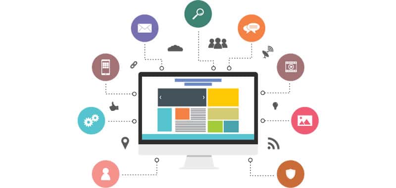
The language used to provide information on the Internet must be sober, concise and concrete
The content will depend directly on the niche of the Web.
The vast majority of users who visit a website do so in search of information, which can be presented in the form of (text, images, video, audio).
It is important to bear in mind that WWW is a means of communication different from those that until now were known (television, radio, press, etc.); the navigator goes from page to page of the web at the rhythm of a mouse click, and usually spends a little time on the same page.
Therefore, textual information should not be abused, as there are very few visitors who read a Web page completely.
It has always been said that an image says more than a thousand words, and although a Web page is not a television program, images are always important.
You must list the information that you want to include in the Web. This information must be meaningful, and useful to the public, in most cases, taking into account what they are interested in and not what the author is interested in.
The language used to provide information on the Internet must be sober, concise and concrete.
It does not work well the insinuating and ambiguous language that can be perfect for graphic notices or brochures.
Everything that is done contributes to forming the image that the public has of the company, brand, product, institution or service.
The Web is not an exception and any feeling of frustration that the user experiences will not be channeled towards him or the authors of the Web site, but to the own image created.
Whether it's a content website, merchant or advertiser of a promotional website, your success in the increasingly crowded Internet depends on turning a casual visit to a site into something that fuels your exploitation model.
If your income depends on advertising, as is the case with many content sites, you will need a large volume of visitors (who visit the site for the first time or who are already habitual).
For a company it will be interesting to maximize the number of transactions that flow on your website.
If you present a promotional website to generate advantages in your business, you will want your website to act as a business card as your credibility, brand and reputation.
The offering of a quality user experience to visitors will depend on the combination or not of advertising and commerce.
Turning casual visitors into loyal users and potential online shoppers into paying customers is important in light of what it costs to create and maintain a site.
These "conversion" problems can be very difficult to solve and constitute the biggest obstacle to obtaining revenue with Web businesses.
It is not cheap to create a web user base on the Internet. It is essential for Web sites to retain new customers through existing services provided by the site.
The response to the acquisition and maintenance of Web users does not necessarily depend on expensive e-commerce systems or fantastic graphics. The real solution lies in the relationship, or exchange of values, that is formed between the website and the visitor around the differentiating content.
Content design
Usability studies indicate that users perform the following process when they access a new page:
- Immediately look at the main content area
- Go through it looking for headlines or other indications
- If the content is not of interest, go through the navigation area to decide where to go
From this point of view, the content is number one.
Writing for the Web
Although it is important to be grammatically correct, it is important to present it according to the way it will be read. In that line it is convenient:
- Be brief and concise. Write no more than 50% of what you would write in a print publication.
- Write to search, short paragraphs, bulleted lists, subheads ...
- Use the hypertext to break the extensive information on several pages
Keep your texts short
Research has shown that reading from the screen is about 25% slower than reading paper. We also know that users do not like to scroll, so try to adjust to the first of the indications.
Make your texts readable
Beware of "words" and spelling mistakes. A spelling and grammar checker should always be used before publishing a text. But it is also convenient to review the texts to avoid those kits that ignore even the automatic correctors.
Exploitability
For the reasons already expressed, users tend not to read large text strings. A study by John Morkes concludes that 79% of users look at the page as it arrives, and only a few read it letter by letter.
In order to favor scalability, the web writer must:
- Structure the articles with two or up to three levels of headline
- Use significant titles and subtitles
- Use lists with bullets and similar elements to break the uniformity of the text blocks
- Use bold, bold, or whatever to capture the user's attention
Flat language
- On the web it is convenient to start the page with the conclusion, the paragraph with the most significant phrase and this one with the most relevant word
- Try to meet the rule of one idea per paragraph
- Use phrases with simple structure
- Limit the use of metaphors, be literal
- Be careful with the use of humorous or sarcastic resources
Fragmented pages
Lay the text without sacrificing the depth of the content and distribute it among different nodes with hypertext links.
Do not segment a long linear text (next page, etc.), try to split it in content areas so that the user knows more about the link than the page number that he will see.
Remember the inverted pyramid principle, first present a brief conclusion and connect with the deeper contents.
Although, we have all become accustomed to scroll in the content pages, the truth is that both in these, and especially in the navigation users have a tendency to judge or choose what you see at the beginning.
Titles of pages
Writing for the web is often writing to be found.
We must know that many search engines will present our page with the content of the <title> tag, so it may be interesting to follow the following indications:
- The optimal title must have between 2 and six words, between forty and sixty characters
- Different titles must correspond to different pages
- Remove the articles from the beginning (think of the alphabetical lists)
- Place the key elements at the beginning of the title
Writing headlines
They are very different from the headlines of the press for two reasons:
- The headlines are often shown out of context
- Even in their own environment, they enjoy less support of auxiliary elements (photos, subtitles, etc.) due to the limited space on the screen
The main indications to follow to write headlines for the web would be:
- Explain clearly about what content will have the information in terms that refer to the user
- Write in plain language, leave literature aside
- Avoid those titles that try to encourage people to click to know what the topic is, people are already very burned with those tricks
- Skip the start items
- Put the keyword at the beginning
- Do not make multi-page titles start with the same word
Readability
Everything we are talking about fails when the user can not read the text. There are a few basic rules to ensure readability:
- Use high-contrast colors for text and background. The best is black text on a white background, although the reverse is almost as good. Among the most ominous combinations we can mention pink text on a green background, which may even be impossible to read for color blind users
- Use graphic backgrounds that may interfere with the ability of the human eye to interpret lines and letters
- Use large enough font sizes. Small letters save them for footnotes or legal notices that few people will read
- Leave the text I want, move it, blink it or climb it will make reading difficult
- Justify it on the left. Of course, centering texts is convenient for some purposes
- The small text is more readable if we use fonts of the family sans-serif, verdana, ...
- Avoid the use of texts in capital letters. An upper case text reads about 10% slower than an uppercase and lowercase
Credibility
There is so much content on the web that it is important to give elements to the user to increase the credibility of our site.
Make the page look professional, avoid heavy funds, animations to link with mail, etc.
Beautiful graphics do not always affect the usability of a page, but it is also true that the visual aspect must be taken care of since it is the first thing the user will see.
In the future it is possible that the concept of credibility is achieved through more or less official ratings or rankings.
Web Communication: the value of network content
A website must provide a series of content typical of an online medium. There is a debate about how the information on the Web should be so that we can talk about authentic Web communication.
Everything revolves around the contents, since they provide users with the Internet key.
The search, structure and design of the user-centered information will enable these contents to become the differential value of a Web site.
The value of content
The best proposal of any website to obtain loyalty to a user is to offer quality content. Perhaps it may be obvious, but having a differentiating content distinguishes Web sites.
This produces a need that causes the user to return to the site on a regular basis. And clearly, the differentiating content offers a whole series of mechanisms (forums, bulletin boards, chat, email, etc.), to establish a relationship with the user that in turn allows him to interact with the other users that are translates into a user experience in which differentiating content is the essential ingredient of Web communication.
But one would have to ask how this differentiating content should be, who creates it, and how to know that it is really contributing significant value to the Web site.
Defining a quality content is talking about a content that differs from the usual that any website of a general nature can offer.
Quality content is rather scarce on the Web, it is not easily obtained or available.
For content providers, giving that added value to content is offering something valuable to users. Therefore, to speak of differentiating content is to consider improving the user's interaction with the website.
In order to understand the difference of the contents on the Web, we would have to start from the free contents and then show the added value of the quality content.
Websites offer a whole series of free content with the aim of attracting and maintaining Web traffic. Anyone who gets the activity of the site to consult without having to pay for what they are looking for.
In this first stage the contents must be of sufficient quality to provide the visitor with the idea that what they are looking for is in that site.
A percentage of advertising revenues will depend to a great extent on this traffic and will be the basis for obtaining loyalty from a user by offering them the option of differentiated content, in a space reserved for subscribers and providing a series of factors that will make that the interaction becomes the added and differentiating value of the Web site and its contents.
That is, an added value represents a payment or a free registration where the user requires personal attention for that contribution of money or information from him.
Websites must define the relationship they want to establish between what they offer and the Web user. This relationship is based on the objectives of the Web. Because the contents of an entertainment website vary clearly from a real estate information site.
Mai-lan Tomsen (2000) proposes categories of values for the exchange of contents according to the objectives of the site and the user's experience and needs.
Websites should study if they offer the expectations generated in the user and know if they meet the objectives of your website.
Tomsen makes it clear that the services offered by a site do not have to be effective elsewhere and that, of course, the content and services are constantly evolving.
The four categories are the following:
- Promotional: Thematic information about a specific product or company on the Web in exchange for brand recognition
- Commercial: Offer products in exchange for payment
- Of other content: Offer added information (news, opinions, etc.) in exchange for traffic on the site to see your advertising
- Entertainment: Provides multimedia content in exchange for traffic to see advertising or references from other sites
Most websites offer at least one of these categories depending on the content and, as we said, the objectives.
Most Web users look for content that shapes and informs them (although we should not ignore the transcendence that currently has the areas of entertainment such as music and television).
Internet users value the wealth of online information. In fact, the most visited sites are those related to search engines and news information sites, information forums and services.
Structure of the information Web
Having information of interest is, without doubt, the first step to build an information system on a website.
The usefulness of an information is clearly defined by its coherent organization. We see many websites that have a good raw material but, nevertheless, the lack of coherence means that it is not available for a Web user.
The amount of information hosted on the Web makes the organization of the information a key element to achieve differentiating and quality content.
The responsibility for the organization of the information in a Web site rests with the information architect. This architect has, in turn, four main functions:
- Define the objective of the system
- Determine what content should be included
- Devise and specify the mechanisms of organization and search in the system, that is, define how the contents will be found by the user through the organization, the navigation system and the search system
- Define a clear policy on the maintenance, updating and growth of the system
A job that requires a multidisciplinary training with knowledge of organization in information, information technology, organizational management, graphic design, marketing, information psychology, usability engineering and HCI (human-computer interaction).
From this multidisciplinarity, it is important to highlight the global perspective of the system and not to focus everything on the particularity of the Web.
The global vision will help us to organize the information of a Web site and to specify the scheme and structure of the organization. The scheme can help us to group the different components of information and the structure will define the relationship between these different components.
A grouping in alphabetical order, by chronology or by geographical arrangement, will allow them to search for a user who knows what they are looking for. It helps to define the exact information of what is sought.
However, an ordering by the decimal classification has a certain subjective character; although it has a certain logic we must have previous knowledge of certain subjects to be able to access the information.
The same as ordinations by themes or functions. The search will depend on the learning and experience that the user may have.
If an alphabetical order is exact, a classification by subject is totally subjective.
What we find on most websites is a hybrid between the two types of organization. For example, a Web portal presents a very scattered information in which the search of some content can be complicated.
It is decided, in general, to organize some topics in alphabetical order. It is a formula that allows the dispersion to be homogenized.
The relation of the different components of the information that is going to be organized is what we could define as structure. We are talking about a criterion of importance, among them, how one can move from one element to another in that relationship.
The hierarchy is the most frequent structure when looking for information, which is perhaps the one we are most accustomed to, to think in a linear way in order of importance. Although really our way of thinking is more destructured and links fragments and ideas with each other; the hypertext structure will allow us to link different areas of the same subject.
However, another structure, the relational one, will allow us to access information in an open manner when we do not know the organization of what we are looking for.
And to move through the organization of information we use navigation.
Talking about navigation involves using a metaphorical language that facilitates movement through a more or less organized information space. The purpose of navigation is to provide the user with the location of where he is.
Navigation would be equivalent to orientation.
A system that indicates the point where you are, where to go, where you come from or where you can go back. There are many systems used to facilitate orientation by information, from navigation bars, drop-down menus, web maps, etc.
To the organization and navigation, we would have to add in all information system a third element so that a user can access what interests him, is the search.
It is one of the main problems encountered by the information architect. Each user searches differently.
If the organization of information can be, as we have seen before, subjective, the search can still be more.
The challenge is to design and develop information systems and Web sites that allow better management of information and can be applied where they can be most useful. And, above all and most importantly, to help increase the mental possibilities of people.
The mental models of each user, both for organizing and searching are absolutely personal. Probably the user looks for information in the way he would have organized it.
The important thing, regardless of the quality and power of the information systems, is that the system is capable of understanding the user's behavior. The effectiveness of the website is determined by a design and user orientation.
The Web is an environment in which power is in the hands of users. The user, who is the one who clicks on the mouse, decides everything.
From the user's point of view, the web information system must have a balance between usability and usability. Understood the utility as something to which you can take advantage and usability as the ease of use of the system.
The usability problems of a website can basically be summarized in the lack of standardization of the interfaces and the complexity of use. In general, all tools do the same, but the way to do it is different.
The philosophy of each tool differs from one brand to another. This means that for the majority of applications, a certain level of prior learning is required, which means that knowing how to use a program supposes an important added time.
In general, without applications and unintuitive and unfriendly systems that incorporate many options that go unnoticed for a user that in the end are not very usable.
Hence, the success of browsers and Web technologies, since they are simple and require a short learning time.
The reasons for the lack of usability of the information systems of a Website are determined because the design of the information is not centered on the user; that is, it is not intended for those who will use the system.
Usability studies show that searching for information and browsing can be very frustrating.
The users usually have problems to understand the proposed schemes and how the information is ordered: graphic designs that do not contribute anything to the structures, little help to build a mental model of information, the poor efficiency of the links that do not indicate where they are going and what it is that can be found and even, problems of legibility of the texts.
If we add to these inconveniences the poor reliability of the system and that users do not consider it safe, the underutilization of all possibilities, the accelerated obsolescence and, above all, the inability to generate the necessary information, we find ourselves with the decrease in utility that a Web system can offer.
Therefore, the increase in usability and usefulness is an important challenge that must be assumed by the architects of the information. We could summarize it in four ideas:
- Reflection on the graphic design specification of the websites
- Reflection and analysis of navigation on the Web
- Design simple Web sites and pages
- Create content adaptable to the Web
Design of Web information
The challenge is to design and develop information systems and Web sites that allow better management of information and can be applied where they can be most useful. And, above all, and most importantly, they help increase the mental possibilities of people.
The structure of the system should be oriented to take advantage of our abilities and not so much to automate certain actions that turn the Web into a simple click on links and fragments.
Hence, working on the presentation of content is part of the design of information, since the Web maintains an information overload that will help us differentiate one content from another.
We must not forget that, in spite of the form, the content comes first.
A whole series of rules can be established that make the contents and information of a website increase its communication possibilities. These rules can be applied both in the text and in the graphic image.
The visualization of the information will help the user to select the nuclei of interest and digest the information.
Being succinct, writing to be able to find things, using the hypertext form of structuring information ... In summary, writing for a Web site will make the contents different and the user will go to the point of information.
Most users seek simplicity and establish a Web communication, means they seek clear approaches to the information that a website can offer. And the improvement of the interaction with the user is contained in three ideas:
- Content of quality
- Update of the information
- Ease of use
If a Web site provides these three keys, we can say that it offers a differentiating Web content.
CITE ARTICLE
For homework, research, thesis, books, magazines, blogs or academic articles
APA Format Reference:
Delgado, Hugo. (2019).
Content on Web pages - Design, writing, and language.
Retrieved Nov 17, 2025, from
https://disenowebakus.net/en/web-contents




One thing about content is clear: you have to practice a lot before you can feel it. Literature lessons never taught me what my copywriting agency taught me - how to write short and straight to the point. Oh, and those keywords...