Responsive Web Design - Tutorial with adaptable examples
To make an adaptable page the technical a half queries, which allows us to condition several styles depending on the resolution of the screen.

Those of us who have been creating sites since the beginning of the web, are used to our pages being "rigid", that is, of fixed width in pixels.In the 90s, the 14-inch monitors with a screen width of 640px were the only ones that existed, and that was the size we gave to our designs, we did not think of another option, we simply defined pixel sizes for all our columns.
Around the year 2000, a second value emerged: 800px wide (there were already monitors of 15 and 17 inches.) The problem was that, if we defined the total width of our site in 800px, the users of monitors of 640px width that still remained, appeared a little elegant and nothing usable bar horizontal scroll The site did not enter the screen.
The solutions for this scenario divided into two sizes were very simple: we made a general container of 640px wide and we centered it leaving a small strip without occupying both sides or we made a site with a defined width in percentages, which stretched slightly between both measurements.
Closer in time, around 2005, the decision to make was similar: there were still 800px monitors (there was no longer a 640px wide monitor), but the majority resolution was 1024px. Then, we gave it a wide liquid (in percentages) so that it stretched between 800 and 1024px, or we created a container of 800px centered, with a few small fringes at the sides, and a resolved issue.
But when the decade of 2010 arrived, a truly revolutionary change altered our scenario. The mobile phones began to navigate the web, using browsers similar to those of a PC (Opera, Safari, Explorer, Chrome and Firefox) and the first tablet appeared (the iPad). From that moment, our design decisions became more complex, due to the diversity of screen sizes with which users browse our sites. For which of all these sizes are we going to design? For all? That's possible?

Some change is necessary in our design methodology, since a liquid design simply does not support being "stretched" from a minimum of 320px to several thousand pixels wide.
And on the other hand, if instead of giving it liquid width, we defined the widths in pixels, the effect would be equally negative: the site will "miniaturize", being very uncomfortable to navigate, depending on the constant use of zoom in both directions and should make horizontal displacements. Something like flying over the website in a helicopter, the way we visualize a map.
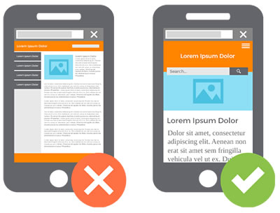
In the current scenario, we can no longer rely on a majority resolution, or two or three, but it is necessary to understand that the resolutions used by users will increasingly be more fragmented and will be more varied, covering intermediate ranges between two points each time more distant: devices smaller than a PC monitor, on the one hand, and increasingly higher resolution screens at the other end.
The era in which we use and abuse sites of fixed width in pixels, grids and columns defined in pixels and even visual design methodologies such as layout using table cells, has already come to an end. It is the end of rigid design. We need something new.
Design as a problem and as a solution
Web pages by nature are "adaptable" from the very beginning of the Web To verify that this hypothesis is correct, let's think of a correctly structured HTML file, with headers, paragraphs and lists. That is, an HTML file to which we do not link any stylesheet, to which we do not model it, for example, the following:
<!DOCTYPE html>
<html>
	<head>
		<title>Aprendiendo HTML5</title>
		<meta charset="utf-8">
	</head>
	<body>
		<h1>Actualizate a HTML5 y CSS3</h1>
		<p>Estamos marcando semánticamente los contenidos de nuestros sitios web, y agregamos microdata. Aplicamos efectos decorativos con CSS3 como sombras, gradientes y relieves.</p>
		<ul>
			<li><a href="index.html">Inicio</a></li>
			<li><a href="contacto.html">Contacto</a></li>
		</ul>
	</body>
</html>
If we try to navigate this file from devices of different sizes, we will not have any problem to access its contents: the text will be egible on a cell phone, on a tablet and on a PC too.
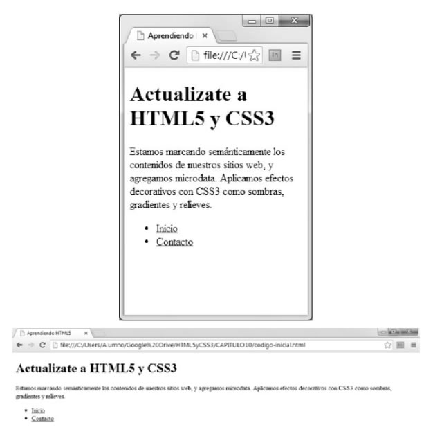
Since it is not "optimized" for those sizes, we never said that it was aesthetically achieved, only that it is adaptable, that it can be used in all sizes.
In conclusion, the problem that makes it difficult to access our websites from mobile phones is generated by our design process: it arises when we add stylesheets and design, giving measurements to each block of contents and the elements that compose it (images, fonts, etc.)
Although more than the design itself, we would say that it is the "over-design" that is responsible for rigidity. The error consists in defining all measurements in pixels, trying to control in detail the location of the information. That is the main cause of this inflexibility.
That is, we are the designers themselves who caused the problem, with our old design process (inherited from graphic media such as paper) and the flaw is in some decisions we make in its course (as the units of measure we choose to apply).
- The fact that we are responsible for the problem is very good news, because if we are causing the problem, the solution is also in our hands. It does not depend on "others", it is not caused by device manufacturers or browsers or HTML editors: it is fully in our hands the decision to make our sites employ adaptable techniques
What are Media Queries?
First of all, the technique: Media Queries is called the possibility of defining conditions that must be met for the browser to process some specific style rules within our CSS sheet.
For example, we could define a condition that determines that if the screen size is less than 480px wide, the browser will process certain CSS styles that we will leave ready. In those styles, we will define ideal designs for a device that meets that condition, that is, that does not exceed that screen width of 480px.
@media screen and (max-width:480px){
	body {
		font-size:80%; // achicamos la fuente en pantallas pequeñas
	}
}
By using this technique, we try to optimize the experience of using a website to adapt the design to the context. In this case, it would be a variable screen size that gives a very particular context to the content, limiting the possible designs.
Combination of conditions to create ranges
We can also combine several conditions into one using the logical operator "and" as many times as sub-conditions we need to combine. In the following example, we will combine two conditions: that it be a screen and that it measure at least 1024 pixels wide.
@media screen and (min-width: 1024px) { }
In this other example, we will combine three conditions: that it be a screen, that it measures more than 320px and less than 768 pixels wide.
@media screen and (min-width: 321px) and (max-width: 768px) { }
- We must take special care in that the values of the ranges that we define do not overlap. That is, if the maximum value of one is 320, we will define the beginning of the next rank in 321 and not in 320 exact, since otherwise the two sheets will be read when a device has exactly that measure
This possibility of combining several conditions will be indispensable to be able to detect the ranges of sizes to which one or another style sheet will be applied
Web Design adaptable / Sensible / Responsive
This technique called media queries, which allows us to condition the reading of different styles, is what opens us the possibility to a new approach to web design, which is ideal to support the enormous diversity of devices currently existing. This approach is known as "adaptive web design" or "responsive web design" (originally).
In large screens (a half querie of "Greater than 1024px", for example) we could float 3 columns, while in a tablet (a half querie of "Greater than 800px", for example) we will only let 2 columns float, and in the case of narrower screens (cellular, without media queries) will cancel all floats, reducing the number of columns to one ("stacking" the contents one below the other).
Let's see what the code would look like:
/* Diseño para celulares */
#columna1, #columna2, #columna3 {
	float:none;
	width:100%;
}

/* Diseño para tabletas */
@media screen and (min-width: 800px) {
	#columna1, #columna2 {
		float:left;
		width:50%;
	}
}

/* Diseño para PC */
@media screen and (min-width: 1025px) {
	#columna1, #columna2, #columna3 {
	float:left;
	width:33%;
}
A code similar to the previous one is the one used to achieve these changes in the Japan Times site:
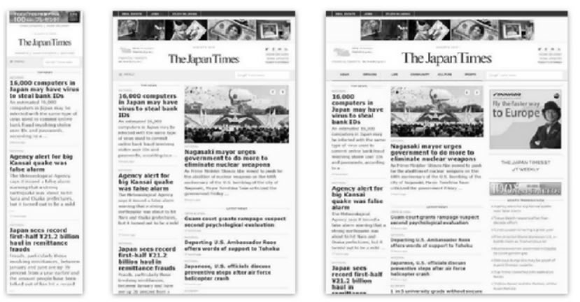
But not only the layout can change between one screen and another; We will analyze below what are the design elements that it is important to adapt so that the web content is optimized for different devices.
Elements of adaptive web design
The central elements of an adaptable or "sensitive" design are at least four:
- Flexible typographic
- Layout Adaptive layout using Media Queries, modifying the number of design columns, with flexible grids, adapting the widths within each range
- Images and adaptable multimedia, changing the size of the images and other linked elements. We must not forget, if the site includes them, the adaptation of videos and animations, and other complex contents such as maps, tables, slides, etc.
- Adaptive navigation, optimized for touch on small screens
In addition, we will apply systematically in all our adaptable pages, two extra elements:
- A meta viewport tag that prevents the "miniaturization" of our pages
- And a compatibilizador script so that the media queries technique works in old browsers
Let's begin to analyze these elements one by one, so we will learn to include them in our projects, so that we can make them adaptable and leave behind the era of rigidity.
1. Flexible typographic scheme
The first design element that will become flexible from our style sheet will be the text. The novelty will be that we will change the most used unit of measurement until the moment to define the size of the sources by means of the property font-size (that is to say, the pixels), by other two more versatile units of measurement.
If we continue using pixels as a unit of measurement for our sources, we will have two types of problems:
- The first one will be caused to some of our users, those who use Internet Explorer, since they will not be able to scale the font if it was defined in pixels (an accessibility problem that will affect our myopic users)
- And the second, it will be a maintenance problem for ourselves, since we should duplicate, triple or more, the declarations of font sizes within each area of the stylesheet, in order to define what its size should be in each range or condition, that is, in each media query. We will understand this problem below
Text first
Where do we start then the coding process (HTML) if we want to apply Media Queries? By the beginning: the text
Ask the step that I always like to ask my students: What is the common denominator of a pizza? Olives? Onions? Tomatoes? Or the dough?
And the common denominator of a Web? Flash? Images? Videos? Or the text?
Once the texts are semantically marked (with h1, h2, p, ul with li), we apply the identifiers and classes that we think are necessary, and we will have the finished basic HTML code. This well-structured text with elementary HTML will be enough for any low-end cellular that a user might still be using.
Typography, always in EM
Now, it was time to define in our style sheet the units of measurement that will make our typographic scheme flexible, to guarantee the legibility of our contents. Let's think that the distance of reading on a PC is close to the meter, much greater than that between our eyes and a phone or tablet that we hold in our hands:
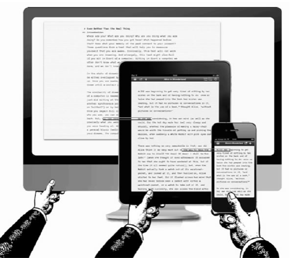
For this reason, font sizes should be greater for a PC than for a tablet, and those of a tablet, greater than those of a cell phone.
To achieve this, we will not use more pixels to define the font size, but we will use the unit of measure em and the percentages, combined in a particular way: to the body (and only to the body) we will define a font-size base in percentage, and the rest of texts, we will define it in em:
body {
	font-size:80%;
}

/* porcentaje base, solo en el body */
p {
	font-size:0.9em;
}
h1 {
	font-size:2em;
}
h2 {
	font-size:1.4em;
}
#pie {
	font-size:1.2em;
}
.epigrafes {
	font-size:1.1em;
}

/* fin de zona común a todas las resoluciones */
@media screen and (min-width:800px) {
	body {
		font-size:100%;
		/* ampliamos los textos si mide más de 800px */
	}
}

/* fin de la zona para más de 800px de ancho de pantalla */
@media screen and (min-width:1200px) {
	body {
		font-size:120%;
		/* ampliamos más aún los textos si mide más de 1200px */
	}
}

/* fin de la zona para más de 1200px de ancho de pantalla */
Notice that we have defined in em the sizes of sources of our contents using indistinctly labels, id or classes, in one place: the initial zone of our style sheet, the one that will be read by all the devices without conditions, since it is not involved in any media query.
On the other hand, when we apply a condition for a certain size, the only thing we change is the base percentage value applied to the body, which will cause the entire typographic scheme defined in ems to scale proportionally to a new size. That is, what we are doing is changing the size of the em, by changing its reference point (which is that percentage that we define in the body).
As an orientation, we can calculate that in most PC screens, at normal font size, the equivalence between ems and pixels is that 1em = 16px, so, if we want to define in the style sheet a text that in Photoshop it occupied 24px, we will divide it by 16 to know its value in em, which in this case would be 1.5em. Attention: use points as a decimal separator, do not eat.
Of course, nothing prevents us from making adjustments to any of the media queries if we want a certain text to have a special measure in one of them. But the starting point will be established automatically.
With these new units of measure, we will be able to create adaptive typographic schemes, which are optimally displayed according to the reading distance of each device.
Note that we are not defining a rigid size, but a proportional relationship between the different text sizes of our page, a proportion that will be maintained throughout all the devices thanks to the fact that we are going to scale the complete schema in each media query.
2. Adaptable layout and flexible grill
Taking advantage of the fact that each zone of the style sheet that we wrap between media queries allows certain styles to be applied only in a range of screen sizes, in each zone we will arrange the contents in columns in a way optimized for the size of the device.
- “Floating or not floating, that's the question”
In principle, let's agree that in a basic cell phone the space is not enough to float two or more columns side by side, so the layout will be extremely simple: we will only let the blocks are stacked one below the other in order of appearance in the HTML code.
From there, we will float as many blocks as we need in each media query.
Flexible grids
The grid consists of defining container and column widths in percentages, so that the blocks of a design maintain a proportion between each other within the range of minimum and maximum width defined in each media query of the previous point.
The formula to calculate the percentages from a sketch in pixels is to divide the width of the element by the one that wraps it:
Size Element / Size Context
Example: 600px / 960px = 0.625
That is, that block that measured 600px inside of a container of 960px must now measure 62.5% (that value comes from 0.625 of the account that we just made)
Repeat the formula in another case:
Size Element / Size Context
Example of 3 columns for photos located within a zone of 480px:
150px / 480px = 0,3125
That is, we must define a width of 31.25% for each of the 3 columns.
Margins and flexible paddings
In this context, we must also make the margins and paddings flexible, so that they do not ruin the proportionality of the spaces achieved with pixels.
- Margin: the context is the width of the parent element (container):
- Ej. 24px / 900px = 0,02666 = 2,66%
- Padding: the context is the width of the element itself to which I apply it
- Ej. 24px / 200px = 0,12 = 12%
3. Adaptable media (images, videos)
If in each zone of the CSS styles delimited by a half query we aim at different images (of different sizes), we will not have problems with background-image:
/* La imagen más pequeña va primero, sin condiciones, porque es para el celular más chico */
.logo {
	background-image: url(logo-chico.jpg);
}

/* Logo mediano, para anchos de pantalla de entre 480 y 800px */
@media screen and (min-width:480px) {
	.logo {
		background-image: url(logo-mediano.jpg);
	}
}

/* Logo grande, para anchos de pantalla de entre 800 y 1280px */
@media screen and (min-width:800px) {
	.logo {
		background-image: url(logo-grande.jpg);
	}
}

/* Logo gigante, para anchos de pantalla de más de 1280px */
@media screen and (min-width:1280px) {
	.logo {
		background-image: url(logo-gigante.jpg);
	}
}
In the case of IMG tags, we will make the image flexible within the minimum and maximum range of a layout:
img, video, object { max-width:100%; }
This will make the image stretch from a minimum to a maximum within the width range of the element that surrounds the photo (column). Since the maximum is its actual size, 100%, consider that width when defining the width of its container element, or vice versa: we create the image at the maximum size at which its container element will arrive.
There are several W3C proposals to specify that the browser download different images according to the screen size (as in the background images) as for example, the possible "picture" label with several "source" tags, each one conditioned by an average query, or that the "img" tag be modified, allowing more than one source to be specified through the srcset attribute. At the time of writing, none of them is standardized or implemented by browsers.
Other cases are to use scalable vector drawings SVG instead of an IMG tag when what the image shows is a drawing with few colors (logos, icons, etc.).
4. Adaptable navigation
Navigation is another of the critical points that must be adapted in a site to allow its use in phones and tablets.
Take for example the navigation of this site:
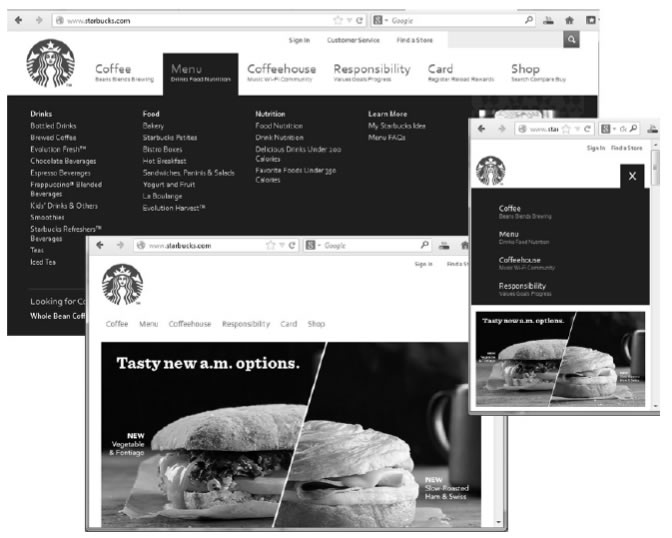
In the case of the PC, we see a series of drop-down sub-menus, from a list (ul) of first level that contains the name of each section in large letters, and with a second line descriptive We see how, in a medium screen size (tablet), that second line disappears, and the font size is smaller. This change can be achieved with something as simple as changing the font-size (as we saw in the first point of this chapter) and hide with display: none the subtitles by default, making them visible with display: block from a certain screen size.
For example:
.subtitulos {
	display:none;
}

/* Hacemos visibles los subtítulos para anchos de pantalla mayores a 1024px */
@media screen and (min-width:1024px) {
	subtitulos {
		display:block;
	}
}
And in the case of navigation on the smallest screen (phone), we see that the same criteria was applied but to hide the huge list of submenus, leaving only the first level buttons, not floating one next to the another and giving them a large size, so that they can be easily pressed with your fingers on a touch screen.
Another quite common case is to replace a visually very large menu that is the one that will be used in the PC, by a select with options in the phone.
In the HTML code, which is the same for all devices, there will be the HTML code of both menus (the form with the select and the "ul" with buttons).
For example:
<ul id="menupc">
	<li>HOME</li>
	<li>CONTACTO</li>
</ul>

<form id="menumovil">
	<select>...etc... </select>
</form>
From the style sheet, in the initial zone of the leaf without conditions, we hide the PC menu and show the cell phone:
#menupc {
	display:none;
}
#menumovil {
	display:block;
}
And in a half query, we'll invert this for when we're on big screens:
@media screen and (min-width:640px) {
	#menupc {
		display:block;
		/* Mostramos el menú de PC */
	}
	#menumovil {
		display:none;
		/* Ocultamos el select para teléfono */
	}
}
This way, we can manipulate the display of different navigation tools, thanks to the media queries.
Configuring the Viewport
The size of the browser's "window" on a PC always matches or is smaller than the size of the screen. That is, either we use the maximized browser, in full screen, or we shrink it a bit. But it is never bigger than the screen.
On mobile, on the other hand, either the browser window matches the screen size (always maximized), or it is larger than the screen size, seeing only a part of it at a time. It is never less since we cannot "shrink" the window to occupy less than one screen. But the opposite can happen, that the content exceeds the size of the screen because we are seeing only a part, due to the use of the zoom.
For example: Safari and Opera Mini assign 980px width to the viewport and zoom to show what a PC-made website entails (and in 99% of cases, they're right!).
Let's see an example comparing the same page without the browser zooming, "miniaturizing", and with the viewport label that prevents it, we will see below:
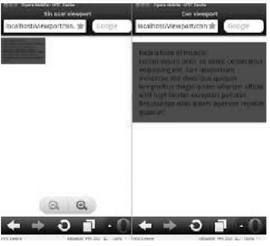
How can we prevent mobile browsers from scaling our sites and miniaturize them? The solution is a new meta tag whose name is "viewport", which is only applied by mobile devices and is ignored in desktop computers.
Its syntax is as follows:
<meta name="viewport" content="width=device-width, initial-scale=1.0" />
Within the content attribute, what we are doing is defining the width of the browser window to have a "real" value; that is, the browser does not "lie" to us, but uses as value of its property "width" the value of another property, which is "device-width", that is, the physical width of its screen.
In that way, a browser inside a device of 320px, for example, will no longer declare a fictional width of 980px, but will leave it at 320px, which is the width of the device, which will not miniaturize our design.
On the other hand, note that we have defined an initial value for the zoom, by means of the initial-scale property to a value of "1" that is equivalent to 100%, that is, the natural size. This way, when the browser enters our page, it will not apply any zoom level that the user had previously configured.
- Attention with the zoom: we should not completely disable the possibility of zooming by the user, since this is an attribution of his. Think, for example, of a myopic user, who needs to expand part of our site. For that, we avoid defining the minimum-scale and maximum-scale values in the viewport label, unfortunately very widespread.
Solutions for browsers that do not understand Media Queries
Older cell phones, whose browsers do not understand media queries, will not have problems in showing a design according to their size if that design is the first in the style sheet and is not wrapped in any condition . Most modern mobile browsers process half queries, so they are not a problem either.
The tablets are new devices, created from the year 2009, with which all your browsers support half queries.
The only compatibility problem we will have in desktop PCs. Most modern PC browsers support medium queries, but some older browsers such as Explorer 8 still exist, and do not interpret media queries.
To fix it, we will use a compatibilizer script called CSS3-mediaqueries-js that can be downloaded at:
https://css3-mediaqueries-js.googlecode.com/svn/trunk/css3-mediaqueries.js
Simply link our HTML page to that script with a <script> tag and from that moment Explorer 8 will interpret the media queries.
As a conclusion, we saw that it is perfectly possible to create browsing experiences through multi-device websites, that is, they can be used with optimized design and tools for different screen sizes, if we take advantage of the media queries technique to create typographic schemes adaptable, flexible layouts and grids, visual elements such as liquid images and videos, and navigation tools optimized for use on touch screens.
CITE ARTICLE
For homework, research, thesis, books, magazines, blogs or academic articles
APA Format Reference:
Delgado, Hugo. (2019).
Responsive Web Design - Tutorial with adaptable examples.
Retrieved Nov 11, 2025, from
https://disenowebakus.net/en/responsive-web-design


