Web Usability - What is it and why is it so important?
The usability is a feature that measures how intuitive and easy to use is a web page for the common user .

Usability is a feature that measures how intuitive and easy to use a web page is for the common user.
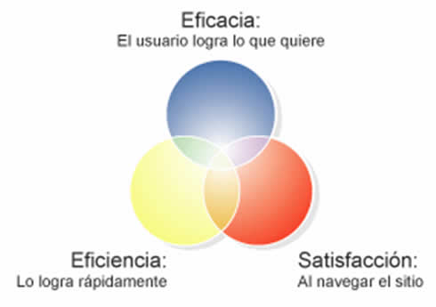
Web Usability Measures 3 big aspects:

Why is usability important?
Usability is a fundamental characteristic for your clients to visit, take advantage of and return to your site again, increasing the success of your Internet strategy.
A portal with usability can:
- Increase visits substantially (typically increase more than 100% after the redesign of the site according to various studies on the subject)
- Reduce times and costs for the user and for the organization
- Transparentar the information (to be able to really find it and consult it)
- Streamline the distribution and precise handling of information
Usability is often confused with interactivity
These are two characteristics that are closely related and that share a space of analysis that often overlap, but both voices are not synonymous. In reality, usability is a broader concept that would encompass not only interactivity, but also all forms of presentation of the data of a hypertext, the tools for its comprehension, the technologies used, etc. and not just the tools that offer interactive use.
The concept of "information architecture", coined by Richard Saul Wurman in 1976, has also been strengthened to refer to the discipline that deals with the design of information spaces, now referred to the digital environment. The information architecture would establish a set of principles, processes and methods that govern its conceptualization and provide the instruments, tools and techniques necessary for its production.
Thus, the conceptualization of hypertext as a space has taken theoretical and practical form and, just as the design of a building is based on 3 basic pillars that are:
- Planning
- Structure
- Functionality
The design of a hypertext is based on the same bases.
The space reading a hypertext is not the page on paper, but the screen
It presents the information in a certain way:
- Text
- Images
- Typography
- Colors
- Homogeneous design
- Multimedia elements
- etc.
The reader does not necessarily read sequentially, but navigates the information through associative or hierarchical links, going through certain routes or pre-set itineraries, jumping from one block of information to another through navigation maps, or using some nodes that make the function of summaries or indexes; even going directly to the information that interests you through the search engines or another series of help and navigation tools, which determine the possibilities of using the hypertext.
The usability of a hypertext refers to the way it is designed so that the user can manage the information, whether it is an independent hypertext management program, the specific document created with it or a page present on the Web. The interface of a hypertext, that is, the mode of presentation of the hypertext to the user, covers the screens and their design, the language used, icons, buttons, help or error messages, and each and every one of the tools navigation, search, help mechanisms, guides and itineraries, etc. among other aspects of user / hypertext communication. The set of all these tools is what determines the usability of the hypertext.
Interactivity is a characteristic that, in part, is determined by usability. Since it is a concrete form of usability, that is, offer the user the necessary tools so that he can make use of that interactivity. A context of use does not necessarily have to be interactive. The simple navigation or exploration by hypertext does not mean that there is interactivity, unless there are appropriate mechanisms to facilitate it.
Usability is not just something potential or the possibilities of using a hypertext. According to Nielsen, utility, as a means to achieve an objective, has a functionality component (functional utility) and another component based on the way in which users can use said functionality. The usability would refer to this second meaning.
The usability would be the extent to which a hypertext can be used by users to fully exploit all the possibilities of hypertext. The usability will allow the user to achieve specific objectives with effectiveness, efficiency and satisfaction in a specific context of use.
Usability has to do with the structure and presentation of information, with the way to display text and images; fonts, colors, shape and color of the links; use of style sheets to give homogeneity to all the nodes; inclusion of metadata and other markup languages to facilitate the subsequent retrieval of information; inclusion of multimedia elements; presentation of sound, visual or moving information; everything related to the form and tools that facilitate navigation, the understanding of information and content; inclusion of automatic verifiers to see if it complies with accessibility standards or with the specifications of hypertext languages such as HTML or XML; support for web browsers; technologies that are included, etc.
The usability is, therefore, closely related to the design of hypertexts, and more specifically with the design focused on the user. The design must take into account the readability and understanding of the text by the user and that navigation is presented as an easy and pleasant fact, navigation tools and other tools for interaction, help, search, guides, etc. they aim to guide and guide the user through the different possible routes to avoid being disoriented and to find quickly and easily the information they need. The information must be clear. The design of the interface must be efficient and effective, easy to use and learn, and the resources and tools used must serve to perfectly fulfill specific functions with as few steps as possible. Easy to use systems reduce effort and motivate and increase their use, since the user adopts a positive attitude towards reading and navigation. But usability does not only refer to the functional management of hypertext, it also has to offer a pleasant design, an aesthetic environment that motivates Hypertext for child users and gain their interest, and with which they feel at ease. The interface also has to be attractive, not just functional. Thus, the usability of a hypertext can be measured both by functional utility, and by the style of its design.
It is about the designer developing a hypertext focused on the users. Ultimately, it is the users and not the designers who determine whether a hypertext is comfortable and easy to use, and whether it meets their needs and fits their tastes. It is necessary to know who the potential users are, since it is not the same to elaborate a hypertext for children, that one for adults or for a person with vision problems. Also the matter will condition the hypertext and the context of use, it is not the same a web page that has as an end the entertainment, that another that pursues a collaborative research work. The tools and environments of use that they will offer will be very different in these two cases, usability as well.
The designer must take into account both the characteristics of potential users and the uses to which the hypertext will be used. These are two fundamental questions before starting to elaborate a hypertext and to offer the tools that facilitate usability.
Whoever constructs a hypertext is also expressed through its design. The hypertext structure, in itself, reflects a way of conceiving the text and the possibilities of its use. Although the structure is extremely complex, the system presented to the user must be extremely simple.
As Jesse James Garret states in The Elements of user experience:
"The web was originally conceived as a hypertext information space, but the development of increasingly sophisticated technologies has led to its use as a remote software interface. much confusion, since the developers of the user experience have tried to adapt their terminology to cases that are beyond the scope of their original application and would have to define each term within its appropriate context and clarify the underlying relationships between the different elements "
In recent years, publications, on and off the network, on usability and user-centered design, have grown at an increasing rate. There is talk of user-centered design and use-centered design. But are they the same thing? In a literal sense, the user-centered design consists of designing by and for the user. The user-centered design takes into account the context in which the hypertext is used. In the design of use, on the contrary, understanding the user and its context is the least important, the important thing is to concentrate on the user's tasks. In the business world it is common to speak of "smart objects" that is, intelligent or elegant products, through design focused on use.
The new ISO 13407 standard, which is entitled "Human centered design for interactive systems", uses the expression "user-centered", but in practice there are few differences between these two approaches. There are those who think that the term "focused on use" is used more as a marketing issue. In any case, what is really important is the way in which the user interacts with the hypertext.
Within the hypertext can also include tools for the user to provide input and suggestions on design and usability, through dialogue and interaction (email, opinion forms, online forums, etc.)
What is clear is that the current and daily use of a technology has also become a determining factor for other technologies to imitate their usability, environment of use and functionalities. The web interface itself has become so popular and popular that it is invading the PC world and even the Windows operating system offers as an option the use of links and the Web browsing system for internal navigation through the hard disk.
Rules on usability
- On the Internet, the user is the one in charge
- On the Internet, quality is based on speed and reliability
- Security
- Trust is something that costs a lot to earn and is lost with a bad link
- If you want to make a decent page, simplify, reduce, optimize
- Put the conclusions at the beginning
- Do not waste people's time with things they do not need
- Good content
Areas of opportunity through usability
- Inadequate use of PDFs
- Minimization of number of "clicks" to find a procedure or service
- Correct typography on a website
- Ease of printing and capture of agendas and events
- Animation and graphics vs. information
CITE ARTICLE
For homework, research, thesis, books, magazines, blogs or academic articles
APA Format Reference:
Delgado, Hugo. (2019).
Web Usability - What is it and why is it so important?.
Retrieved Nov 13, 2025, from
https://disenowebakus.net/en/web-usability


