Web Accessibility - Definition, characteristics and examples
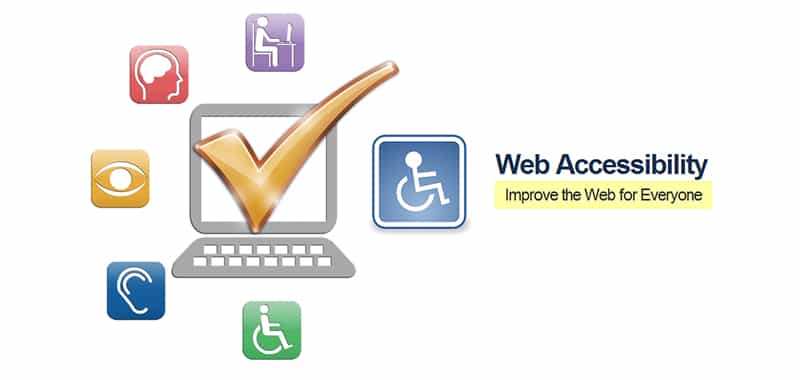
Web accessibility means that people with some type of disability will be able to use the Web.
What is Web Accessibility?
Web accessibility means that people with some type of disability will be able to use the Web.
In particular, when talking about Web accessibility, we are referring to a Web design that will allow these people to perceive, understand, navigate and interact with the Web, in turn contributing contents.
Web accessibility also benefits other people, including elderly people whose abilities have declined as a result of age.
Web accessibility encompasses many types of disabilities, including visual, auditory, physical, cognitive, neurological and speech problems.
There are millions of people with disabilities who can not use the Web.
Currently, most Web sites and Web software present accessibility barriers, which makes it difficult or impossible to use the Web for many people with disabilities.
The more software and accessible Web sites are available, the more people with disabilities will be able to use the Web and contribute more efficiently.
But Web accessibility also benefits organizations and people without disabilities.
For example, a basic principle of Web accessibility is flexibility with the aim of satisfying different needs, situations and preferences.
This flexibility will benefit all those people who use the Web, including people who do not have any disability but who, due to certain situations, have difficulty accessing the Web (for example, a slow connection), we would also be talking about those people who suffer a transitory incapacity (for example, a broken arm), and of people of advanced age.
What does it mean that a website is accessible?
What any Internet user, with any technology and environment from which they access the Internet, is able to enter, understand and interact with complete ability on the site.
How can that ability be diminished?
For different types of obstacles:
- Physical-psychic: (permanent, temporary). Those disabilities, inherent in the individual, that hinder interaction with the web. Thus, a person who can not walk should not be considered a disabled person on the Internet.
- Contextual: They depend on the environment in which the Internet user accesses the web. For example: When a user connects to the Internet to buy tickets at an ATM or access an information point on the street, there is a lot of noise and no sound signals are perceived. The light that hits the screen means there is not much contrast between colors, etc.
- Technological: They are related to the technological support with which the user accesses the Internet (hardware and software). For example: There are Internet access devices (PDA, mobile phone), which are small, with little contrast on their screens, without a mouse, etc. There are also those who still have old browsers or a modem connection, which means that many websites can not be seen or take so long to load that the user gives up.
What mistakes can I be making and how do I make my website accessible?
We can detect errors:
- Conceptual: In the conception of accessibility have been established a series of false topics that should be clarified
- Practical: In the own development of the web
Conceptual: : False topics
There are many clichés and erroneous beliefs that arise around this question:
“Accessibility is only for the disabled and making the website accessible harms the rest of users”
Accessibility is for all potential Internet users:
- Quantitatively: Enter users who until now could not do it or had problems
- Qualitatively: Improve the user experience of our entire audience
In addition, as we pointed out in a previous section, the disabilities on the Internet are not as "traditionally" we understand them: We will all end up becoming older.
We can all accidentally break an arm and not be able to use the mouse. We can all have a depression and with it our ability to pay attention.
“Making an accessible page implies great economic costs and does not compensate”
- This cost is concentrated in the development phase and is relative to the degree of functionality of the page. In addition, it is more expensive to create different versions for different browsers as has been done in recent years
- It is profitable in the medium and long term
- Increases the audience: The accessible pages will be paid alone through more satisfied users
- Costs are reduced: For example, in bandwidth by decreasing the amount of code on the pages by use of standards
- Different versions for browsers are avoided
- The separation between structure and content greatly facilitates the maintenance of the site; the use of standard technology guarantees interoperability; Syntactic precision simplifies the detection of problems or errors; and semantic correction enhances efficient content management
- Branding: By including all users and improving their experience, a positive image of the website is encouraged
- It guarantees a future durability by the use of standards
“Involves simple and aesthetically poor designs”
- Most of the current designs can be made accessible without greatly changing their visual appearance
- Making an accessible website, you gain in usability
- Freedom is granted to the user to customize the presentation of the websites. Internet, SHARE d to traditional print media, allows the user to intervene in the presentation of the message according to their needs and preferences (for example, increase the letter of the texts, upload or not upload the images of the webs, etc.)
Practical: in Web development Web
The WAI (Accessibility Initiative), a group dependent on W3C, works on a series of guidelines and guidelines for developers to create their pages eliminating the obstacles that prevent access to the webs
To do this, they have developed a guide that includes Accessibility Guidelines for Web Content (WCAG) that contains a total of 14 guidelines to follow with their respective verification points that allow the developer to apply the guidelines step by step and verify compliance.
Main errors and ways to solve them
The following is a reduced and summarized list of errors and some recommendations.
Images
ALT Attribute
The Attribute provides the means to describe the image for those who can not see it.
The description can be "analog", we tell what is seen in the photo, what in the opinion of the author is useful in art criticism or so, or functional, we count the function and content of the image of the page.
In the case of purely decorative images or graphics it is better not to include text in the ALT attribute.
In any case, it should be brief and not occupy more than 8 or 10 words.
We must offer alternatives to visual content.
How?
Using the attribute alt = "Description of the image" or longdesc = "path of the file with the description"
Why?
- Because there are those who browse without viewing the images: For example: Those who use screen readers or text mode browsers (Lynx). Who disable in the options of their browsers the load of images, because they have slow connections or because they pay for amount of information downloaded (mobile devices)
- Because it improves the indexaction of search engines. It increases the semantic load in the code of the website in general and helps the indexaction of search engines that have image search
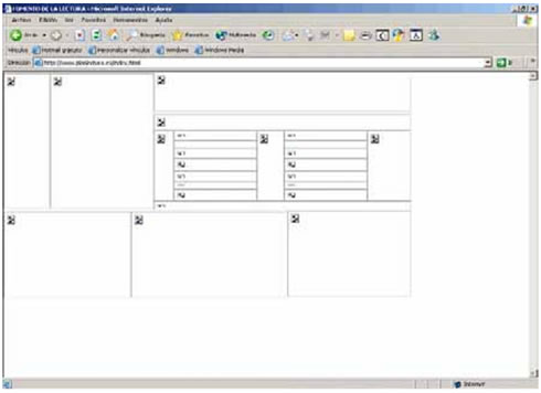
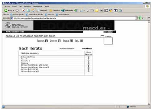
The previous image is a page seen in Explorer, configured for the non-visualization of the images. The user who enters this page will see absolutely nothing and therefore leave the website.
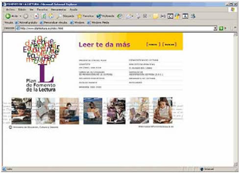
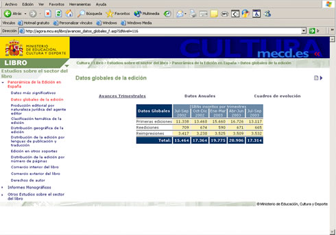
In this other image, the same page is represented with the loaded images. In this regard, comment that the texts should not be images. The same effects can be done with CSS.
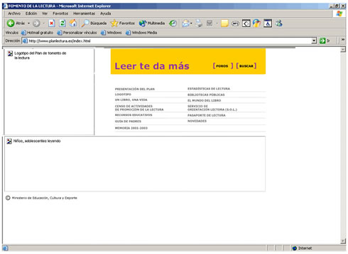
In this other image, the page is presented with the alt attribute in the images.
Information with colors
Sure that resources are understandable when viewed without color.
Make How?
Using colors with contrast and that color is not the only mechanism to interpret information. Therefore, you do not have to use color as the only informative reference.
For example: A link that says "Press the red square"
Why?
- Because there are devices with non-visual output (braille) or low contrast (monochromatic monitor, mobile, etc)
- Because in contexts with bad lighting it is difficult to appreciate the contrasts
- Because there are people who do not perceive some colors (colorblind, etc.)
This image represents a page with a header with little contrast of colors and icons of color as a reference.

In this other image the same page appears in grayscale. The details are not appreciated in the header (the word Education is lost, which indicates the section in which the user is) and no difference is seen between the dictionary icon.
Marcos / frames
Its use should be avoided and alternatives should be used and identified.
How?
- The alternative is included with the <noframes> tag
- Identification is done through the title attribute. Representative names should be used
Why?
The frames do not show a clear URL to the user:
- This generates navigation difficulties and causes disorientation
- It also causes problems in search engine indexing
- The user incorrectly registers the URLs in favorites or can print the unwanted frame
- Old browsers do not support them. Etc, etc, etc.
Tables
You have to create tables that transform correctly.
How?
- Avoiding the tables for the design. Most pages can be done with CSS
- In tables of contents, you must identify the row and column headers with the <th>, tag, the data cells <td> and title the table with <caption>
The image represents a page made with design tables (used only for layout ) and tables of contents (with data).
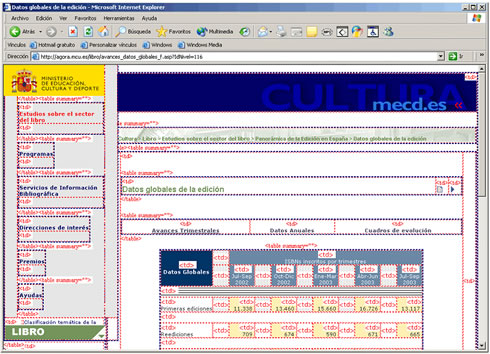
This other image is the same page, showing a high degree of nesting of tables for the design, which generates a lot of excess code.
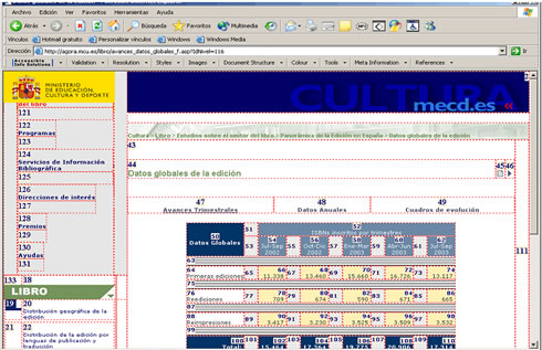
In this image, the same page appears with the tabulation order of the tables (it affects keyboard navigation and reading by screen readers).
It is appreciated, for example, that the navigation keypad is in position 121 onwards.
Why is Web Accessibility important?
The Web is a very important resource for different aspects of life: education, employment, government, commerce, health, entertainment and many others.
It is very important that the Web is accessible in order to provide equal access and equal opportunities to people with disabilities.
An accessible Web page can help people with disabilities to participate more actively in society.
The Web offers people with disabilities an opportunity to access information and interact.
Another important consideration for companies is that Web accessibility is a requirement established in some cases by laws and policies.
Why do we need accessibility?
For several reasons:
Etichal reasons:
- Seeking accessibility is doing it well. Encouraging accessibility on the Internet helps to improve us as people
Social reasons:
- Accessibility on the Internet allows a wider audience to participate. The accessible pages stimulate individual participation, since they allow the potential public to expand to millions of people with disability problems, slow connections or old computers
- Encourages group participation of social sectors, such as remote populations from economic centers, indigenous peoples, low-income neighborhoods, etc.
- It helps us to achieve social goals of full participation and equality as it helps to reduce the so-called "digital divide or gap" and, by extension, the "social gap" since, although it is true that there is currently more people who access information and communication technologies (ICT) that ten years ago, it is also true that the difference between people who have access to information is greater than those who do not. And in this case, accessibility plays an important role
- It contributes to strengthen diversity, allowing broad groups of the population not only to receive information passively (as in the case of mass media such as television or newspapers), but to contribute their opinions and participate in the construction of a more balanced society
- It helps the labor insertion through teleworking, not only by expanding the job offer for people with disability problems, but for the owners of old computers or for those who only have access from telecentres or cybercafés (allowing savings in transportation, food and more availability of free time and productivity, among other advantages) among many other groups favored by this way of working
- It implies support for the so-called "small and medium-sized enterprises" (SMEs) and micro-enterprises, which possess computer equipment that, in most cases, is not state-of-the-art and does not have the necessary resources to update it
Economic reasons
- If the potential client who tries to enter our commercial site, is faced with accessibility problems, it is very likely that he will stop using that site, in which we have invested so much time and money
- Having an accessible commercial site improves the corporate image of the company
Technical reasons:
- Surfing the Internet is no longer an activity that is done from a single type of equipment, but now you can browse from cell phones, interactive kiosks, televisions, etc. Each of these equipment has its own characteristics, so only accessible sites can adapt to such a variety of navigation systems
Making the Web accessible
Web accessibility has always been understood as the responsibility of Web developers. But, Web software also has an important role in Web accessibility.
It is important that the software helps developers generate and evaluate accessible websites so that people with disabilities can use them.
One of the functions of the Web Accessibility Initiative (WAI) is to develop guidelines and techniques that provide accessible solutions for Web software and Web developers.
The WAI guidelines are considered as international Web accessibility standards.
Making your website accessible
Making an accessible website can be simple or complex, it depends on many factors such as the type of content, the size and complexity of the site, as well as the development tools and the environment.
Many of the accessible features of a site are implemented in a simple way if they are planned from the beginning of the development of the website or at the beginning of its redesign.
Modifying inaccessible websites may require a lot of effort, especially those that are not "tagged" correctly with standard XHTML tags, and sites with a certain type of content, such as multimedia.
Evaluating the accessibility of a website
When developing or redesigning a website, the accessibility assessment early and throughout the development allows accessibility problems to be found at the beginning, when it is easier to solve them.
Simple techniques, such as changing the settings in a search engine, can determine if a Web page meets some of the accessibility guidelines.
A thorough evaluation, to determine compliance with the guidelines, is much more complex.
There are evaluation tools that help to perform accessibility assessments. However, no tool in itself can determine whether or not a site meets the accessibility guidelines.
To determine if a website is accessible, human evaluation is necessary.
Accessibility for users with disabilities
There are legal norms of different territorial and jurisdictional scope that tend to facilitate access to web resources for people with disabilities.
In the face of e-business, users with disabilities become loyal customers of providers that offer good services and are suited to their circumstances.
Before the Web, disability is defined as the condition of the user that hinders or prevents the use of traditional methods of entry / exit of the computer as they were conceived.
Applying these concepts to the Web is little more than going back to the HTML philosophy itself, separating the contents of the presentation. This allows special browsers for the disabled to access the content without problems.
Web Accessibility Initiative
Within the initiatives and specifications of the WWW consortium (W3C), there are WAI specifications.
These standards say mainly what should be done, but in practice should be prioritized compliance with standards and plan a process of accessibility review and implementation based on the following points:
- The homepage and high traffic pages should be redesigned so that they follow the minimum accessibility rules immediately. The same is applicable to be critical points in e-commerce processes or important transactions
- Next, all new pages should be created complying with the regulations and specifications of high and low priority, and pass an adequate test before publication
- After this, the average traffic pages should be progressively re-adapted to the high priority specifications
- As a long-term goal, high-traffic pages should be readjusted to meet all accessibility standards, and extend this procedure to all components of the website
Visual disabilities:
In the current state of the Web, the most serious accessibility problems pose to blind or visually impaired users. For example, it is important to control color combinations to avoid their dysfunction with color blind users.
It is important not to make pages too large (the observed measure is between two and three printed pages), and use the tags <h1>, <h2>... to format the text and facilitate its understanding at a glance.
NNever assign absolute sizes of fonts (font). Myopic users like to configure their browser to use large fonts.
Hearing impairments
Since its inception, the Web is an eminently visual medium.
In fact, in most cases usability remains the same when we deactivate the sound.
In any case, the design must be done taking into account users with hearing disabilities or those whose equipment lacks sufficient technical means to reduce the sound.
This involves including text transcriptions of the speeches that are included in sound formats, as well as in the videos that include locutions.
Oral disabilities
At this date, there is no problem because voice-based interfaces are scarce and not exclusive.
Looking ahead, a progressive growth of this type of interface can be envisaged, which means that we will have to be careful with the implementation of alternative means of interface for users with speech difficulties.
Motor disabilities
These refer basically to the motor difficulty that prevents the user either moving the mouse with precision or pressing several keys simultaneously.
This affects, in terms of web design, the realization of images with very complex or precise options maps, as well as the inclusion of resident image maps in the server, which in the beginning should be avoided.
The inclusion of applets or other interactive objects must be taken care of, whose design has to fulfill specifications of a more general range to allow their use at the margin of the mouse.
Cognitive disabilities
In the beginning, the Web was used only by very intelligent people who were pioneers of advanced technologies.
But now that it is becoming a massive market, there is the entry of a large number of people who move the cultural environment downward.
It is important to increase usability to ensure that the content can be understood by readers of a graduate school level.
But also must take into account issues such as:
- Difficulty memorizing complicated URLs or codes
- Difficulties to mentally visualize complex structures
- Difficulties to write orthographically correct
- Difficulties for dyslexics
How is Web accessibility measured?
In order to correctly manage the levels of Web Accessibility, the W3C established some verification points, classified by priority levels, which facilitates its use to web page developers.
Priority 1 is for the verification points that the Web developer has to satisfy. Otherwise, the site will not be accessible to some groups of people
Priority 2 is for the verification points that the developer must reach so that users do not find it very difficult to access the site in question.
Priority 3 is the one that the developer must reach so that users do not find it difficult to access the site.
In this way, the sites can be divided into A, AA, and AAA, the latter level indicating the highest degree of accessibility.
 Level "A" of compliance in Web Accessibility Level "A" of Conformity means that all the Priority 1 verification points have been satisfied, and graphically expressed with the following logo, which can be put on the Web page in question.
 Level "AA" of conformity in the Web Accessibility The "Double-A" level of Compliance expresses that all the Priority 1 and 2 verification points have been satisfied.
 "AAA" level of compliance in Web Accessibility The "Triple-A" level of Conformity means that all Priority 1, 2, and 3 verification points have been satisfied.
W3C created these "Logos of Conformance with the Accessibility Guidelines for Web Content (WCAG)" with the idea that suppliers of content can use them freely on their sites, to indicate their declaration of compliance with a specific level in accordance with the Accessibility Guidelines for Web Content 1.0
In any case, W3C is not responsible for the use of these logos by content providers, and its guidelines are not normative.
Tools:
Automatic review
WAI works also so that the technologies and programming languages used in the Web (HTML, CSS, XML, SMIL) contribute to improve accessibility, and there are other icons that graphically express the degree of compliance with the guidelines of the WAI for each of those languages. For example:

The validation pages of the W3C are available to the user at:
For the user of Spanish language, there is a simple way to know if a Web page meets the accessibility criteria.
To find out, you can use TAW (Web Accessibility Test), available at http://www.tawdis.net/.
This is a Web tool for the analysis and information of the degree of accessibility that other Websites present.
Its objective is to spread accessibility as a requirement in the design and realization of Web pages in order to allow access to all people.
How does it work?
The system reads the page online (the URL is entered in a website of the Taw website) or off-line (the program is downloaded and executed locally), analyzes it based on the WAI verification points and generates a report with the result of the analysis.

Manual review
The automatic review is not enough, because there are elements that require "human intelligence" or because the current tools still do not validate.
For example, a change of language within a page or check if an appointment is correctly marked.
To do this, it is convenient to use the table of verification points and manually review them one by one from a sample of pages on the website.
In addition, the WAI recommends verifying the correct functioning of the pages of the website under different circumstances in which some users will access them. Among them:
- Use a text-only browser or an emulator
- Use several graphic browsers with:
- Sounds and graphics loaded
- Graphics not loaded
- Sounds not loaded
- Without a mouse
- Frames, scripts, style sheets and applets not loaded
- Use several browsers, old and new
- Use a voice browser, a screen reader, a magnification software, a small display, etc.
Conclusion: Pragmatic accessibility
It has a high degree of difficulty to ensure 100% accessibility of a Web site.
In any case, a pragmatic criterion must be adopted taking into account that most of the issues only require a certain care and foresight when designing the elements, without penalizing in excess time or development costs.
A simple way to check accessibility is to view our pages in a text-only browser, such as Lynx.
It is also convenient to check the site with a color blind, and oneself in a colorless, grayscale equipment.
The possibility of testing the site with disabled users, given the variety of disabilities that exist, is only a priority in sites specially dedicated to a group of this type.
CITE ARTICLE
For homework, research, thesis, books, magazines, blogs or academic articles
APA Format Reference:
Delgado, Hugo. (2019).
Web Accessibility - Definition, characteristics and examples.
Retrieved Nov 14, 2025, from
https://disenowebakus.net/en/web-accessibility


